# Radio cards have landed

Published: October 31, 2024

Version: ^1.0.19

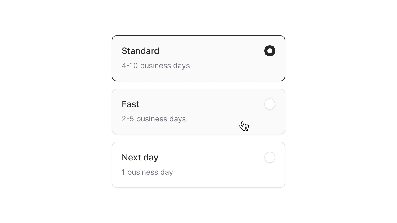
<img class="rounded-2xl border" src="/img/blog/cards_radio_vertical.png" alt="Vertical radio cards" />

You know those big boxy toggle thingy's you use to configure your new laptop purchase? Yep, those are radio cards; simple, bordered boxes that behave like radio buttons—meaning only one can be selected at a time.

Welp, we've got em' in Flux now, and using them is as simple as adding `variant="cards"` to a radio group:

```

<flux:radio.group wire:model="shipping" variant="cards">
    <flux:radio value="standard" label="Standard" description="4-10 business days" />
    ...
</flux:radio.group>
```

By default, the cards will be laid out horizontally, but you can easily control this using simple flex box utilities like `.flex-col`. This makes it really easy to change the layout on mobile with a responsive utility like `.max-sm:flex-col`:

```
<flux:radio.group variant="cards" class="max-sm:flex-col">
```

Adding a cube icon to a card is as simple as passing an `icon="cube"` prop:

```
<flux:radio icon="cube" ... />
```

<img class="rounded-2xl border" src="/img/blog/cards_icon.png" alt="Radio card with icon" />

If you want cleaner looking cards, you can remove the radio indicator by passing `:indicator="false"` into the radio group.

```

<flux:radio.group variant="cards" :indicator="false">
    ...
</flux:radio.group>
```

<img class="rounded-2xl border" src="/img/blog/cards_no_indicator.png" alt="Radio card with no radio indicator" />

For most cases, this level of customization is enough, but still, there might be times where you need full control over the contents of each card.

If that's the case, you can compose these radio cards your self with the full-form syntax:

```html
<flux:radio.group variant="cards">
    <flux:radio>
        <div>
            <flux:heading>Standard</flux:heading>
            <flux:subheading size="sm">4-10 business days</flux:subheading>
        </div>

        <flux:radio.indicator />
    </flux:radio>
</flux:radio.group>
```

[Read the radio card documentation ->](https://fluxui.dev/components/radio#radio-cards)

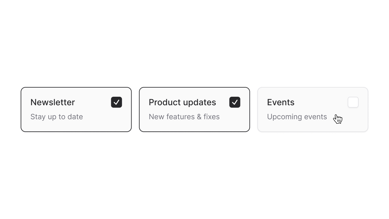
Although less common, there might be times you want the appearance of cards, but the behavior of checkboxes. Flux also supports `variant="cards"` for checkboxes:

```
<flux:checkbox.group variant="cards">
    <flux:checkbox label="Newsletter" description="Stay up to date" />
    ...
</flux:checkbox.group>
```

<img class="rounded-2xl border" src="/img/blog/cards_checkbox.png" alt="Checkbox card variant" />

Of course, all of the aforementioned properties and customizations are available to checkbox cards as well.

[Read the checkbox card documentation ->](https://fluxui.dev/components/checkbox#checkbox-cards)

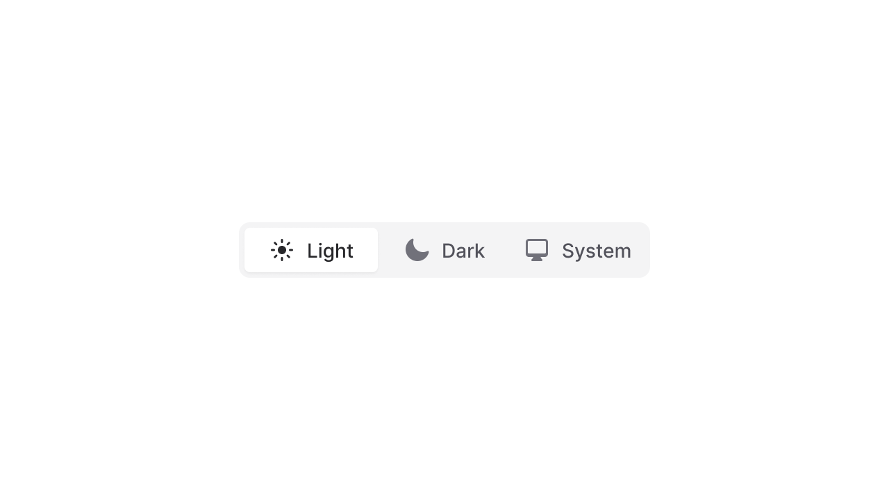
While we were adding new radio variants, we decided to add another commonly requested one: Segmented radio buttons.
<img class="rounded-2xl border" src="/img/blog/cards_segmented_radio.png" alt="Segmented radio buttons variant" />

Just like cards, you can use segmented buttons with the `variant="segmented"` prop:

```html
<flux:radio.group variant="segmented">
    <flux:radio label="Light" icon="sun" />
    <flux:radio label="Dark" icon="moon" />
    <flux:radio label="System" icon="computer-desktop" />
</flux:radio.group>
```

[Read the segmented radio documentation ->](https://fluxui.dev/components/radio#segmented)

---

Creating radio and checkbox variants like these is much more than just visuals. Each of these is fully controllable with a keyboard, uses a roving-tabindex to mimic the focus behavior of native checkboxes and radio buttons, and supports the proper attributes and roles so that screenreaders recognize these as standard form controls.

These are among the many details that differentiate Flux among other component libraries. We care deeply about providing world-class UI components that look amazing in the browser, feel amazing in your editor, and are accessible to as many people as possible.

## Changelog

* Add radio cards variant
* Add checkbox cards variant
* Add segmented radio group variant
* Change to solid icons for segmented tabs and radios
* Add two pixel focus outline offset to radio, checkbox, and switch to match native outlines
* Sortable column backgrounds were getting cut off on mobile 
* Translate "No results found" strings in combobox and listbox
* `:href` properties were being escaped, causing links with ampersands to be malformed
* Support `as="div"` to render a button as a div

[View full release on GitHub](https://github.com/livewire/flux/releases/tag/v1.0.19)
