# Custom icon sets, file inputs, click outside modals, & more
Published: November 3, 2024
Version: ^1.0.20
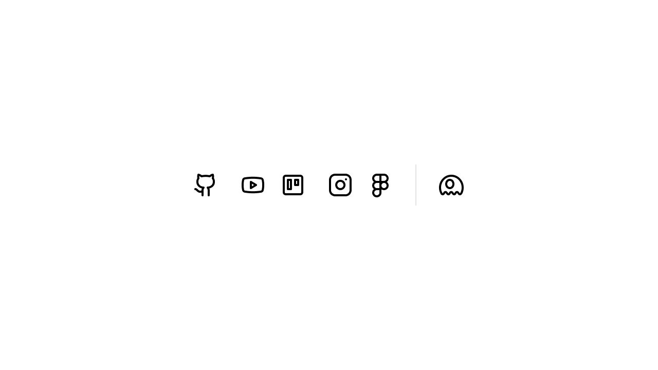 Flux ships with the entire [Heroicons](https://heroicons.com/) icon set by default. As with anything the Tailwind folks do, it's excellent.
However, at ~400 icons, it's more limited than other alternatives.
If there's an icon in your project that you need but isn't available in Heroicons, it's probably available in [Lucide](https://lucide.dev/icons/).
In version v1.0.20 of Flux, we've shipped a new command to easily import individual Lucide icons into your project:
```bash
php artisan flux:icon
```
You will be prompted to enter the names of any icons you want, and it will import them locally into your project and format them as Blade components ready to use with Flux.
If Lucide doesn't have what you need still, you can just add your icons manually to the following directory in your project:
```
resources/views/flux/icon/your-custom-icon.blade.php
```
[Read more about adding custom icons ->](https://fluxui.dev/components/icon#lucide-icons)
## Custom file input
Flux ships with the entire [Heroicons](https://heroicons.com/) icon set by default. As with anything the Tailwind folks do, it's excellent.
However, at ~400 icons, it's more limited than other alternatives.
If there's an icon in your project that you need but isn't available in Heroicons, it's probably available in [Lucide](https://lucide.dev/icons/).
In version v1.0.20 of Flux, we've shipped a new command to easily import individual Lucide icons into your project:
```bash
php artisan flux:icon
```
You will be prompted to enter the names of any icons you want, and it will import them locally into your project and format them as Blade components ready to use with Flux.
If Lucide doesn't have what you need still, you can just add your icons manually to the following directory in your project:
```
resources/views/flux/icon/your-custom-icon.blade.php
```
[Read more about adding custom icons ->](https://fluxui.dev/components/icon#lucide-icons)
## Custom file input
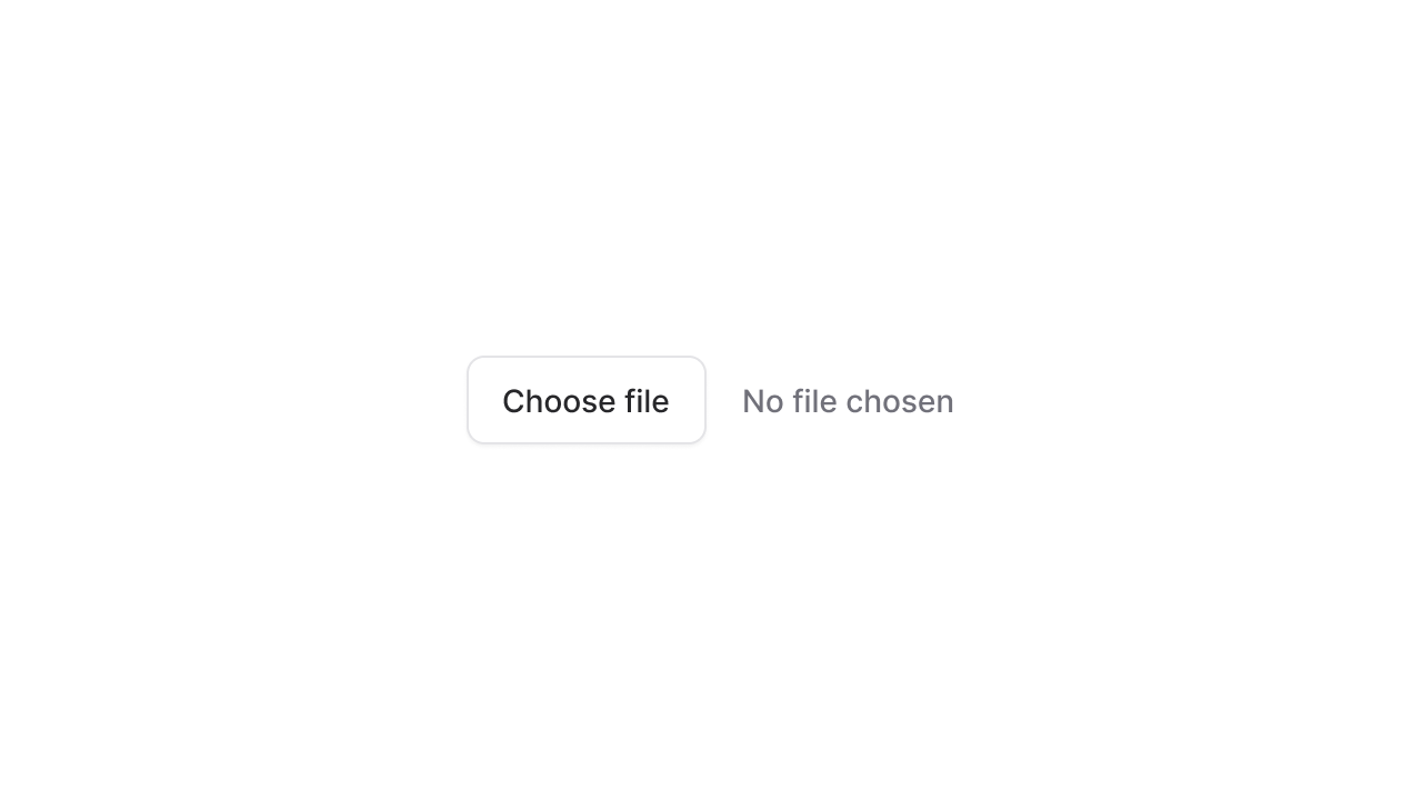 The browser's default file input element is unstylable and frankly, looks outdated.
We've added our own simple wrapper around the native file input and exposed it through `type="file"` on the input component:
```php
```
Of course, we made sure our wrapper works just as well with both the keyboard, mouse, and screen readers as the native input does.
[Read more about file inputs ->](https://fluxui.dev/components/input#file)
## Closing modals by clicking outside
The browser's default file input element is unstylable and frankly, looks outdated.
We've added our own simple wrapper around the native file input and exposed it through `type="file"` on the input component:
```php
```
Of course, we made sure our wrapper works just as well with both the keyboard, mouse, and screen readers as the native input does.
[Read more about file inputs ->](https://fluxui.dev/components/input#file)
## Closing modals by clicking outside
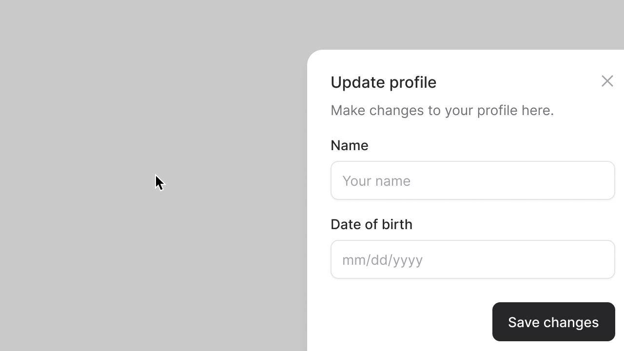 Flux uses the browser's new(ish) `