# Multi-selects
Published: November 13, 2024
Version: ^1.0.23
 We held off on releasing multi-selects at launch because we felt like there were too many decisions to get right, but here we are. In Flux version 1.0.23 and above, you are now able to pass the `multiple` prop and turn a single-select into a multi-select:
```php
Photography
...
```
Of course, data binding works as you'd expect, by passing the name of a Livewire property into ` wire:model`, Livewire will keep the state of that property in sync with your selections:
```php
```
```php
](https://fluxui.dev/components/select#multiple-select)
## Custom selected suffix
We held off on releasing multi-selects at launch because we felt like there were too many decisions to get right, but here we are. In Flux version 1.0.23 and above, you are now able to pass the `multiple` prop and turn a single-select into a multi-select:
```php
Photography
...
```
Of course, data binding works as you'd expect, by passing the name of a Livewire property into ` wire:model`, Livewire will keep the state of that property in sync with your selections:
```php
```
```php
](https://fluxui.dev/components/select#multiple-select)
## Custom selected suffix
 After your first selection, Flux shows the number of items selected, followed by the word "selected".
If you want to customize this to make it more contextual, you can do so using the `selected-suffix` prop:
```php
```
[Read more about selected suffixes ->](https://fluxui.dev/components/select#selected-suffix)
## Checkbox indicator
After your first selection, Flux shows the number of items selected, followed by the word "selected".
If you want to customize this to make it more contextual, you can do so using the `selected-suffix` prop:
```php
```
[Read more about selected suffixes ->](https://fluxui.dev/components/select#selected-suffix)
## Checkbox indicator
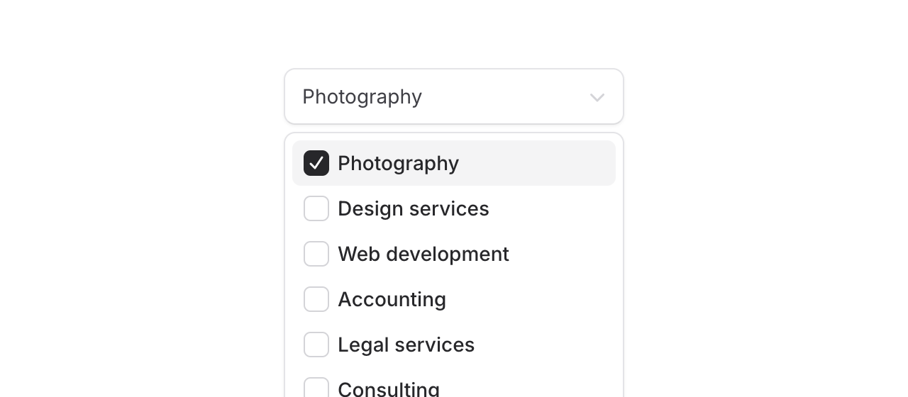 The default check mark icon is now configurable for multi-selects. If you want a checkbox visual indicator instead, you can use the new `indicator` prop:
```php
```
[Read more about custom select indicators ->](https://fluxui.dev/components/select#checkbox-indicator)
## Changelog
* Support for multi-selects
* Dispatch input events when select listbox clearable button is clicked so that wire:model.live picks up the change
[View full release on GitHub](https://github.com/livewire/flux/releases/tag/v1.0.23)
The default check mark icon is now configurable for multi-selects. If you want a checkbox visual indicator instead, you can use the new `indicator` prop:
```php
```
[Read more about custom select indicators ->](https://fluxui.dev/components/select#checkbox-indicator)
## Changelog
* Support for multi-selects
* Dispatch input events when select listbox clearable button is clicked so that wire:model.live picks up the change
[View full release on GitHub](https://github.com/livewire/flux/releases/tag/v1.0.23)