# Callouts
Published: March 10, 2025
Version: ^2.0.5
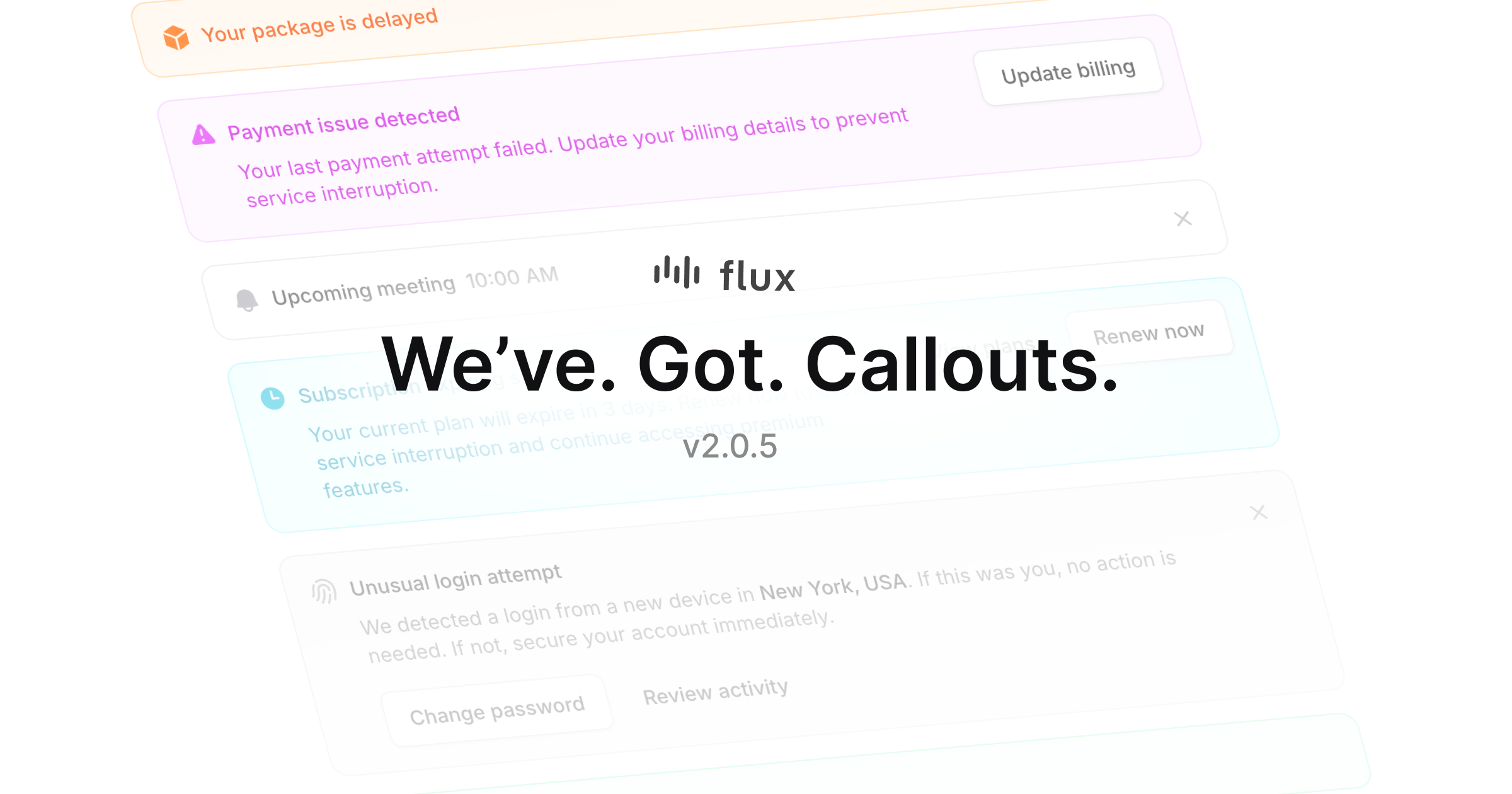 We just added **Callouts** to Flux! These components help draw attention to important information in your app and guide users on what to do next. Great for announcements, alerts, and feature highlights.
## Colors & variants
We just added **Callouts** to Flux! These components help draw attention to important information in your app and guide users on what to do next. Great for announcements, alerts, and feature highlights.
## Colors & variants
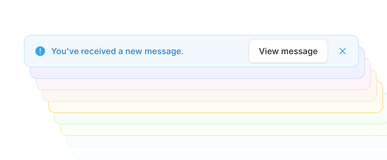 Callouts ship with common variants for visually signaling different levels of urgency like _success_, _warning_, and _danger_. However, we also support any Tailwind color you'd like to use instead.
[Learn more about variants and colors →](/components/callout#variants)
## Actions
Callouts ship with common variants for visually signaling different levels of urgency like _success_, _warning_, and _danger_. However, we also support any Tailwind color you'd like to use instead.
[Learn more about variants and colors →](/components/callout#variants)
## Actions
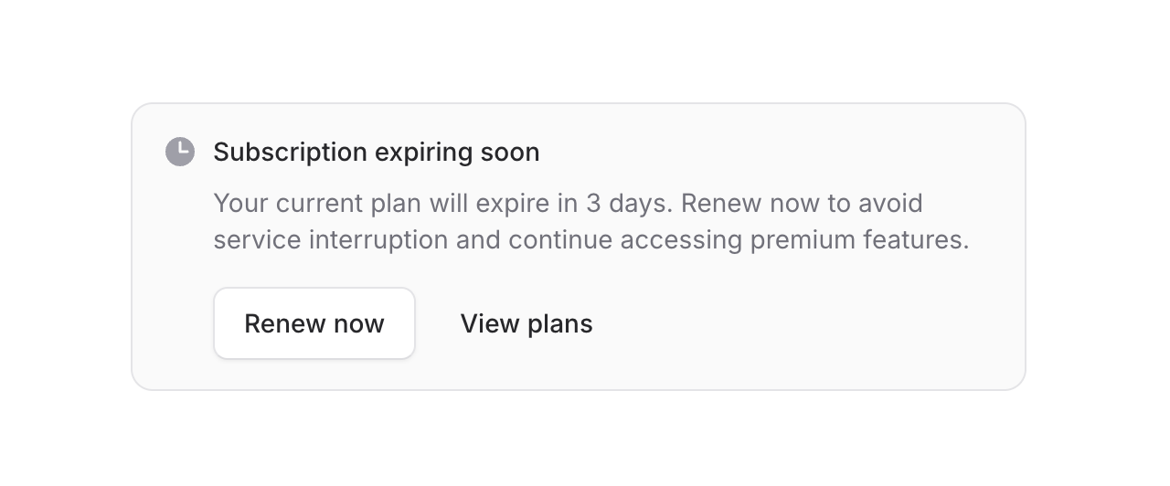 Callouts support action buttons to make it easy for users to take the next step right away. For tighter spaces, our "inline" mode puts actions right next to your message.
This works really well for things like upgrade prompts, account notifications, or introducing new features.
[Explore callout actions →](/components/callout#with-actions)
## Flexible layout
Callouts support action buttons to make it easy for users to take the next step right away. For tighter spaces, our "inline" mode puts actions right next to your message.
This works really well for things like upgrade prompts, account notifications, or introducing new features.
[Explore callout actions →](/components/callout#with-actions)
## Flexible layout
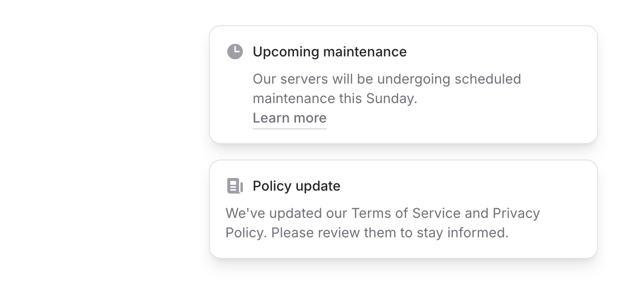 Sometimes you may want to render your callout icon inside the heading to save space. Controlling this is as simple as adding the `icon` prop to the heading component instead of the root callout.
[See callout layout examples →](/components/callout#icon-inside-heading)
## Dismissible
Sometimes you may want to render your callout icon inside the heading to save space. Controlling this is as simple as adding the `icon` prop to the heading component instead of the root callout.
[See callout layout examples →](/components/callout#icon-inside-heading)
## Dismissible
 Flux callouts offer a dedicated _controls_ slot for adding compact action buttons. This makes it easy to do things like add dropdown menu shortcuts or dismiss icon buttons and control their behavior however you want.
[Learn about dismissible callouts →](/components/callout#dismissible)
---
Callouts are available now as of Flux v2.0.5. Like all Flux components, they're fully responsive and dark mode ready right out of the box. We hope you find them useful—we know we will!
Flux callouts offer a dedicated _controls_ slot for adding compact action buttons. This makes it easy to do things like add dropdown menu shortcuts or dismiss icon buttons and control their behavior however you want.
[Learn about dismissible callouts →](/components/callout#dismissible)
---
Callouts are available now as of Flux v2.0.5. Like all Flux components, they're fully responsive and dark mode ready right out of the box. We hope you find them useful—we know we will!