` that you can do whatever you want with.
They're great for things like custom filters and hover cards.
```blade
...
```
## Hover to reveal
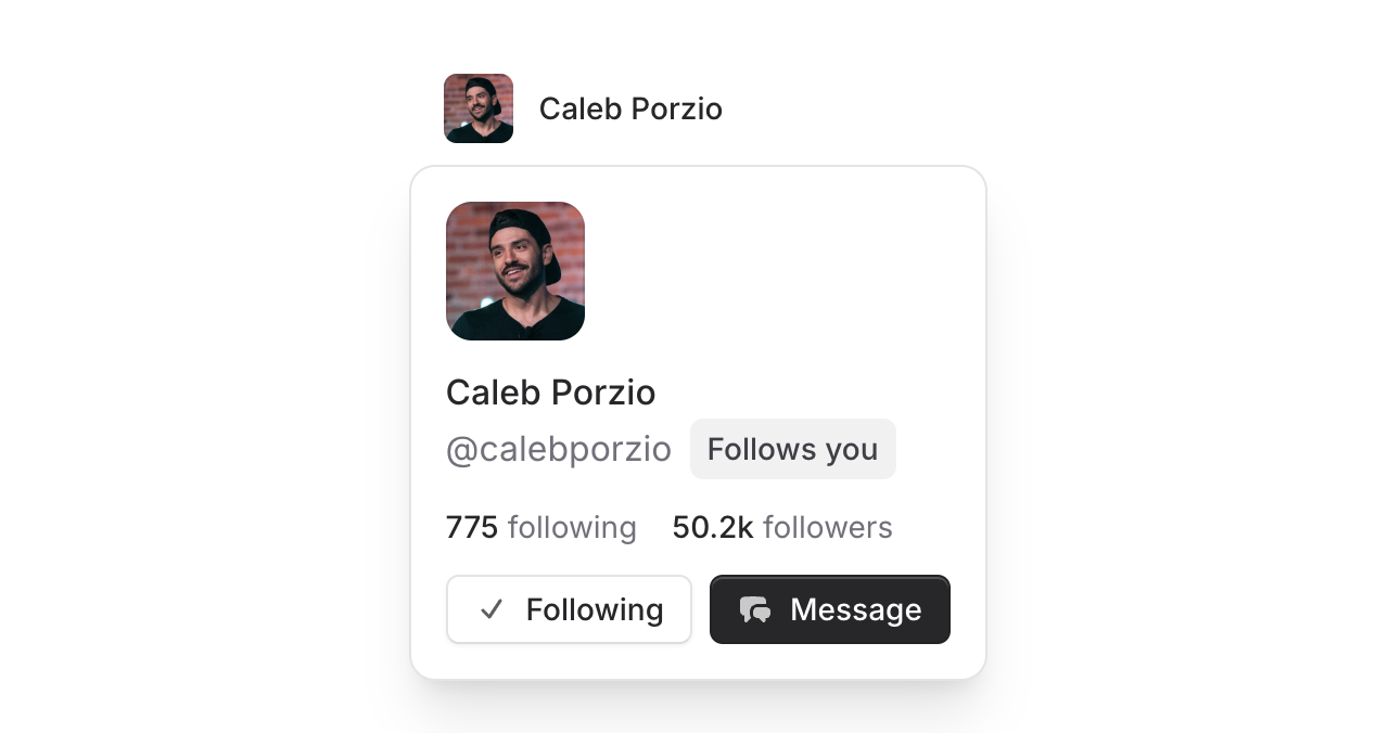
Want to show additional information when users hover over elements? Just add the `hover` prop and you're set. This is perfect for user profile previews, interactive tooltips, or any contextual information you want to reveal on hover.
[Learn more about hover triggers →](/components/popover#hover-trigger)
## All. The. Details.
As with every other component in Flux, we left no stone unturned and sweated every detail for this popver.
**Programmatic control**: Bind the open/closed state to a Livewire property for complete control over when the popover shows and hides.
```blade
Profile
...
```
**Accessibility by default**: ARIA attributes like `aria-expanded` are automatically managed for you. Screen readers get all the context they need about the popover's state and relationship to its trigger.
**Native browser behavior**: Because we use the native `popover` attribute under the hood, you get all the goodness that comes with it—Escape to close, Enter to open, proper tab order, and the popover will automatically close when you tab away from it.
**Anchor positioning**: The popover intelligently positions itself next to the trigger element. You can fine-tune everything with `offset`, `gap`, `position`, and `align` props.
**Smart edge detection**: If the popover would open too close to the bottom of the screen, it flips to show above instead; same for left/right edges.
**Overflow handling**: When there's not enough room to show the full popover content, it becomes scrollable automatically so nothing gets cut off. Your users can always access everything inside.
All of this complexity is completely hidden from you as the developer. Just drop in the component and it works beautifully everywhere.
---
Check out the [Popover documentation](https://fluxui.dev/components/popover) for more examples and detailed API reference.
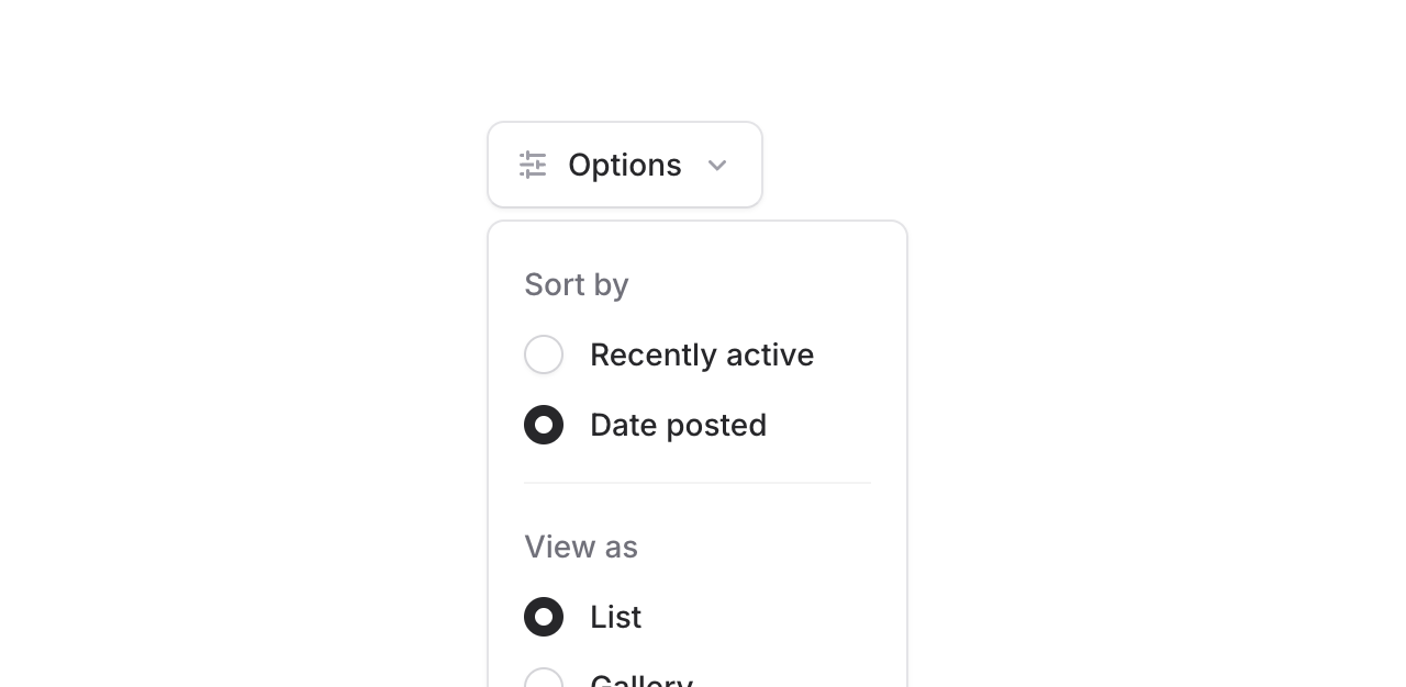 Meet the new **Popover** component. It's a dropdown, but instead of the "menu" part, it's a generic `