# File upload
Published: September 30, 2025
Version: ^2.5.0
Flux now ships with a complete **File Upload** component built for modern file handling. Drag and drop, progress tracking, file previews—it all works beautifully right out of the box.
```blade
```
## Drag and drop
The file upload component handles drag and drop automatically. Users can drag files directly from their desktop, or click to browse—whatever they prefer. The component automatically provides visual feedback when files are dragged over using data attributes you can style with Tailwind's `in-data-dragging:` prefix.
## Compact inline layout
For tighter spaces, add the `inline` prop to the dropzone for a horizontal layout that takes up less vertical room:
```blade
```
[See the inline layout →](/components/file-upload#inline-layout)
## Built-in progress tracking
Add the `with-progress` prop and the component shows real-time upload progress. No extra JavaScript needed—it's all handled for you.
```blade
```
The component exposes CSS variables (`--flux-file-upload-progress` and `--flux-file-upload-progress-as-string`) so you can create custom progress indicators if you need them.
[Learn more about progress tracking →](/components/file-upload#progress-indicator)
## Completely customizable
The `flux:file-upload` wrapper handles all the complex functionality—drag and drop, file selection, upload progress—while letting you use any custom HTML you want for the appearance. This is perfect for things like custom avatar uploaders or specialized file inputs.
```blade
```
The component provides `data-dragging` and `data-loading` attributes that you can target with Tailwind's utility prefixes for dynamic visual feedback.
[Explore custom uploaders →](/components/file-upload#custom-uploader)
## Display uploaded files
The `flux:file-item` component displays uploaded files with automatic image previews, formatted file sizes, and action buttons. It handles all the details—file name display, size formatting (KB, MB, GB), and thumbnail generation.
```blade
@foreach ($photos as $index => $photo)
@endforeach
```
## Seamless Livewire integration
Works perfectly with Livewire's file upload system. Just add `wire:model` and you're done—single files, multiple files, validation, temporary URLs, it all just works.
The documentation includes complete examples for both single and multiple file uploads with full Livewire component code.
[Check out the Livewire integration examples →](/components/file-upload#livewire-integration)
## Works as a native file input
The file upload component dispatches all the same events and has all the same properties as a native `` element. This means you can likely use it with your favorite third-party library.
## Accessibility built in
We made sure the file upload component works great on both mobile devices and screen readers. All interactive elements have proper ARIA labels, keyboard navigation works exactly as you'd expect, and focus management is handled automatically.
---
Check out the [File Upload documentation](https://fluxui.dev/components/file-upload) for complete examples and API reference.
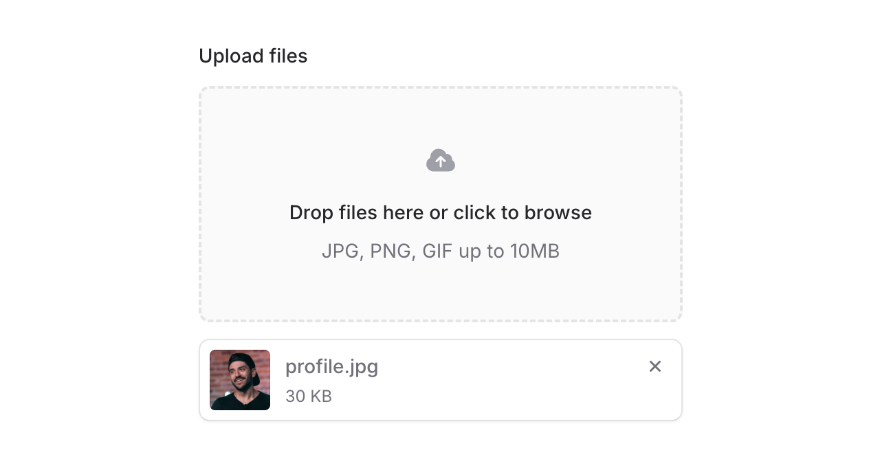 Flux now ships with a complete **File Upload** component built for modern file handling. Drag and drop, progress tracking, file previews—it all works beautifully right out of the box.
```blade
Flux now ships with a complete **File Upload** component built for modern file handling. Drag and drop, progress tracking, file previews—it all works beautifully right out of the box.
```blade
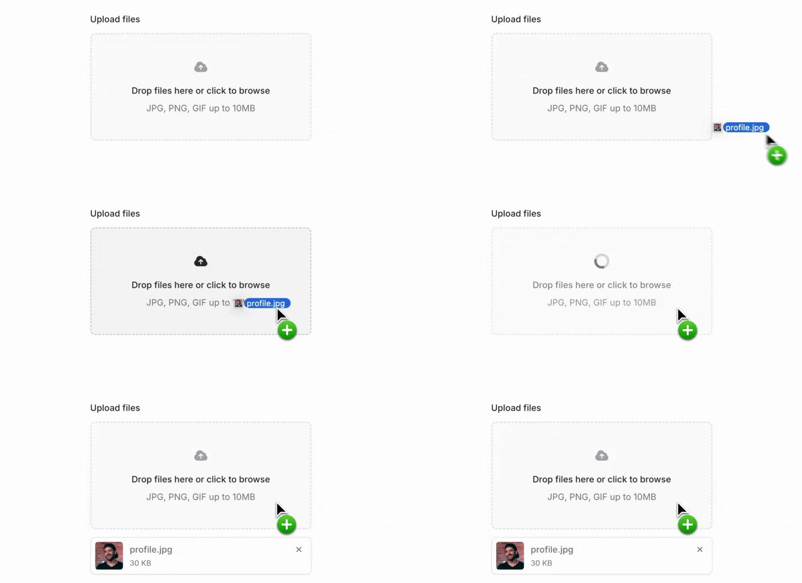 The file upload component handles drag and drop automatically. Users can drag files directly from their desktop, or click to browse—whatever they prefer. The component automatically provides visual feedback when files are dragged over using data attributes you can style with Tailwind's `in-data-dragging:` prefix.
## Compact inline layout
The file upload component handles drag and drop automatically. Users can drag files directly from their desktop, or click to browse—whatever they prefer. The component automatically provides visual feedback when files are dragged over using data attributes you can style with Tailwind's `in-data-dragging:` prefix.
## Compact inline layout
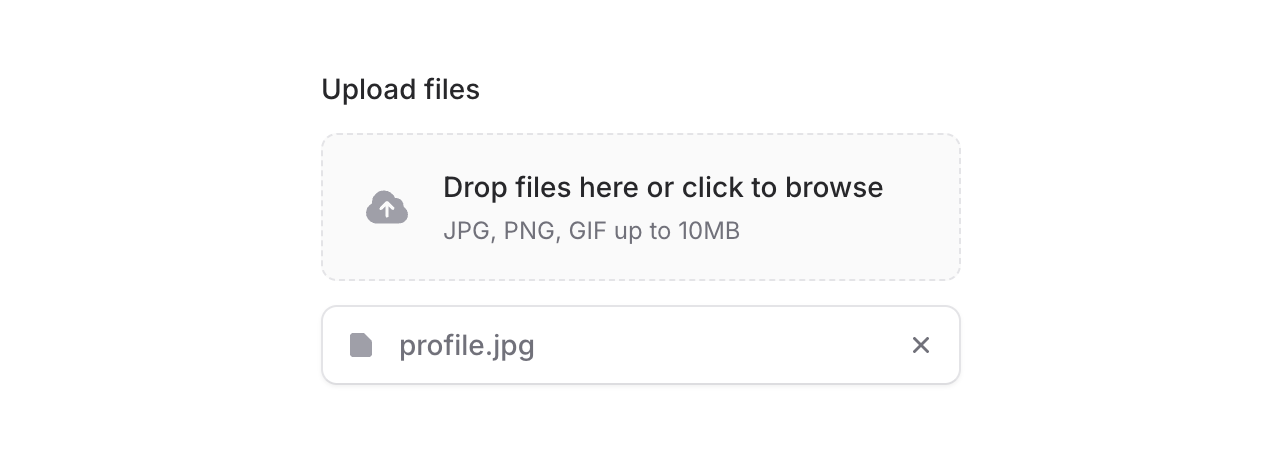 For tighter spaces, add the `inline` prop to the dropzone for a horizontal layout that takes up less vertical room:
```blade
For tighter spaces, add the `inline` prop to the dropzone for a horizontal layout that takes up less vertical room:
```blade
 Add the `with-progress` prop and the component shows real-time upload progress. No extra JavaScript needed—it's all handled for you.
```blade
Add the `with-progress` prop and the component shows real-time upload progress. No extra JavaScript needed—it's all handled for you.
```blade
 The `flux:file-upload` wrapper handles all the complex functionality—drag and drop, file selection, upload progress—while letting you use any custom HTML you want for the appearance. This is perfect for things like custom avatar uploaders or specialized file inputs.
```blade
The `flux:file-upload` wrapper handles all the complex functionality—drag and drop, file selection, upload progress—while letting you use any custom HTML you want for the appearance. This is perfect for things like custom avatar uploaders or specialized file inputs.
```blade