# Composer
Published: November 24, 2025
Version: ^2.7.1
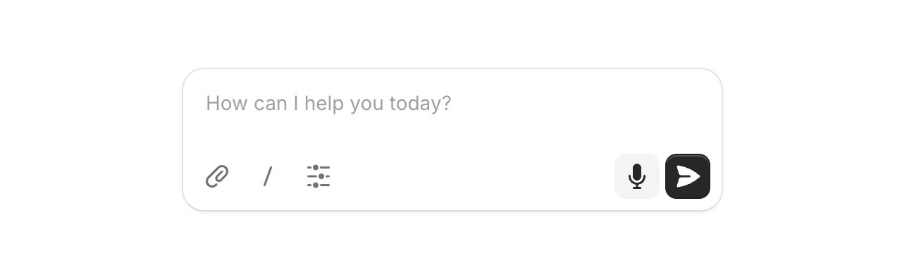 AI is everywhere, and chat interfaces are the new norm. We figured it was time Flux had a proper message input built for exactly this.
Meet **Composer**, a configurable message input with support for action buttons and rich text. Let's take a look.
```blade
```
## Two layouts
AI is everywhere, and chat interfaces are the new norm. We figured it was time Flux had a proper message input built for exactly this.
Meet **Composer**, a configurable message input with support for action buttons and rich text. Let's take a look.
```blade
```
## Two layouts
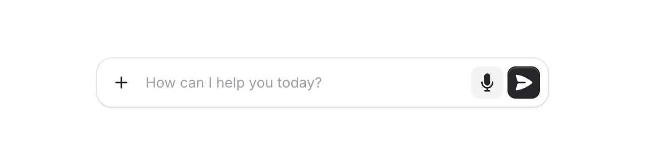 By default, action buttons sit below the input in their own row. Add the `inline` prop to place them alongside the input for a more compact look—great for single-line prompts.
```blade
...
```
## Rich text
By default, action buttons sit below the input in their own row. Add the `inline` prop to place them alongside the input for a more compact look—great for single-line prompts.
```blade
...
```
## Rich text
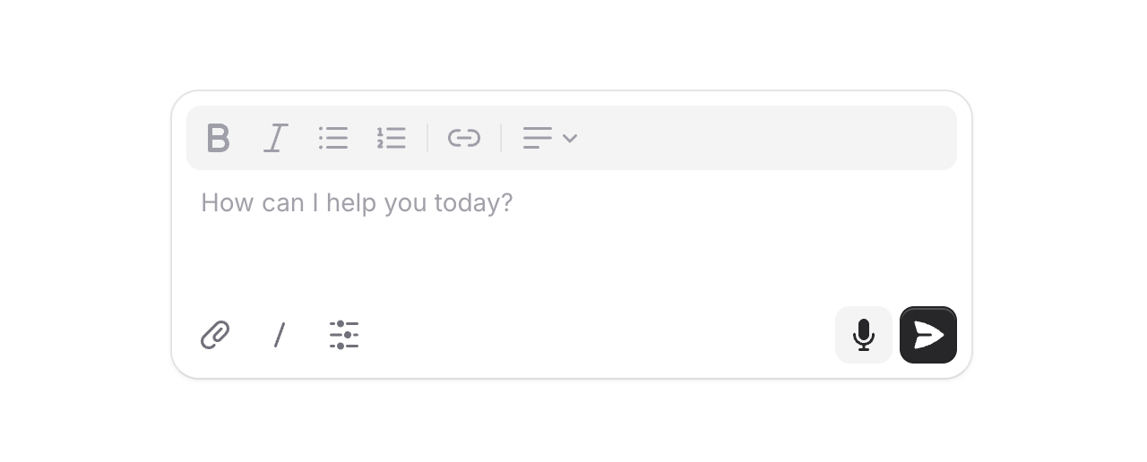 Need formatting? Swap out the default textarea for a full rich text editor by passing an `editor` component to the `input` slot.
```blade
...
```
## Submit behavior
By default, pressing Cmd/Ctrl + Enter submits the form. For a chat-style experience where Enter sends immediately, just add `submit="enter"`.
```blade
...
```
## Height control
Set the initial height with `rows` and let it grow with `max-rows`. The input auto-expands as users type, then becomes scrollable.
```blade
...
```
## Accessibility
And of course, we went to great lengths to make sure this component honors expected keyboard navigation, focus behavior, and proper aria-labels so that screen readers can use it just as well.
---
Check out the [Composer documentation](https://fluxui.dev/components/composer) for more examples and the full API reference.
Need formatting? Swap out the default textarea for a full rich text editor by passing an `editor` component to the `input` slot.
```blade
...
```
## Submit behavior
By default, pressing Cmd/Ctrl + Enter submits the form. For a chat-style experience where Enter sends immediately, just add `submit="enter"`.
```blade
...
```
## Height control
Set the initial height with `rows` and let it grow with `max-rows`. The input auto-expands as users type, then becomes scrollable.
```blade
...
```
## Accessibility
And of course, we went to great lengths to make sure this component honors expected keyboard navigation, focus behavior, and proper aria-labels so that screen readers can use it just as well.
---
Check out the [Composer documentation](https://fluxui.dev/components/composer) for more examples and the full API reference.