# Progress bar
Published: February 27, 2026
Version: ^2.13.0
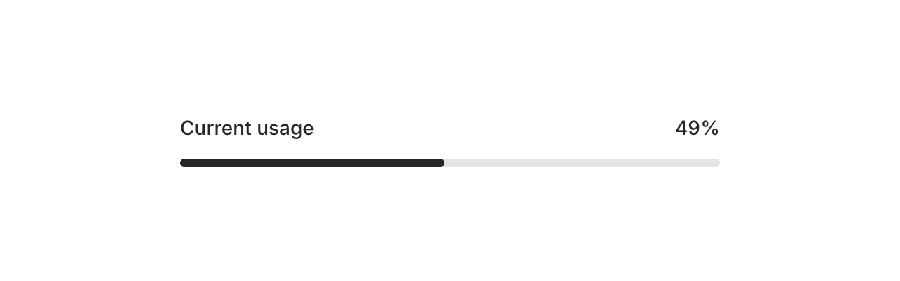 Meet the new **Progress** component — a simple, flexible progress bar for showing completion, upload status, or any value-over-max scenario in your app.
```blade
```
By default, the max is `100` and the bar uses your app's accent color. Let's take a look at what else it can do.
## Custom max values
Not everything is a percentage. Use the `max` prop for custom scales — steps in a wizard, files in a batch, levels in a game, whatever:
```blade
```
## Color and height
Meet the new **Progress** component — a simple, flexible progress bar for showing completion, upload status, or any value-over-max scenario in your app.
```blade
```
By default, the max is `100` and the bar uses your app's accent color. Let's take a look at what else it can do.
## Custom max values
Not everything is a percentage. Use the `max` prop for custom scales — steps in a wizard, files in a batch, levels in a game, whatever:
```blade
```
## Color and height
 Override the fill color with the `color` prop, and adjust the height with a Tailwind class:
```blade
```
## Dynamic binding
Bind the progress value to a Livewire property using `wire:model` so it updates in real-time:
```blade
```
This is perfect for long-running tasks like file uploads, data imports, or background jobs where you want to reflect server-side progress as it happens.
## Accessibility
And of course, we went to great lengths to make sure this component honors expected keyboard navigation, focus behavior, and proper ARIA attributes so that screen readers can communicate progress status just as well.
---
[Check out the progress docs →](https://fluxui.dev/components/progress)
Override the fill color with the `color` prop, and adjust the height with a Tailwind class:
```blade
```
## Dynamic binding
Bind the progress value to a Livewire property using `wire:model` so it updates in real-time:
```blade
```
This is perfect for long-running tasks like file uploads, data imports, or background jobs where you want to reflect server-side progress as it happens.
## Accessibility
And of course, we went to great lengths to make sure this component honors expected keyboard navigation, focus behavior, and proper ARIA attributes so that screen readers can communicate progress status just as well.
---
[Check out the progress docs →](https://fluxui.dev/components/progress)