# Timeline
Published: March 1, 2026
Version: ^2.13.0
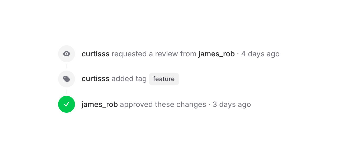 Flux's new Timeline component makes it easy to display a sequence of events or steps to your users. Check it out:
```blade
curtisss requested a review
```
Each item has an **indicator** (icons, numbers, text — whatever you want) and a **content** area.
## Vertical, horizontal, with status
Flux's new Timeline component makes it easy to display a sequence of events or steps to your users. Check it out:
```blade
curtisss requested a review
```
Each item has an **indicator** (icons, numbers, text — whatever you want) and a **content** area.
## Vertical, horizontal, with status
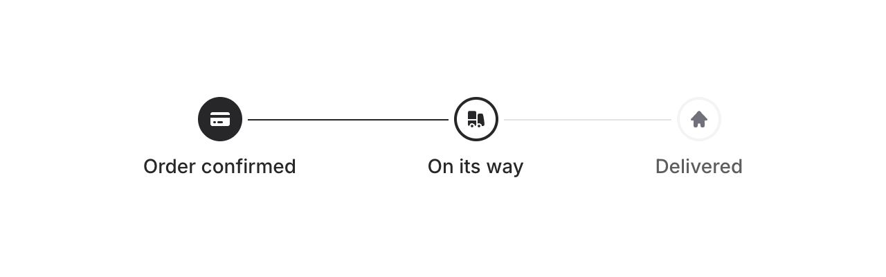 Add `horizontal` to flip the layout. Combine it with the `status` prop (`complete`, `current`, `incomplete`) to show progress — connector lines between items update automatically:
```blade
...
...
...
```
## Baseline alignment
Add `horizontal` to flip the layout. Combine it with the `status` prop (`complete`, `current`, `incomplete`) to show progress — connector lines between items update automatically:
```blade
...
...
...
```
## Baseline alignment
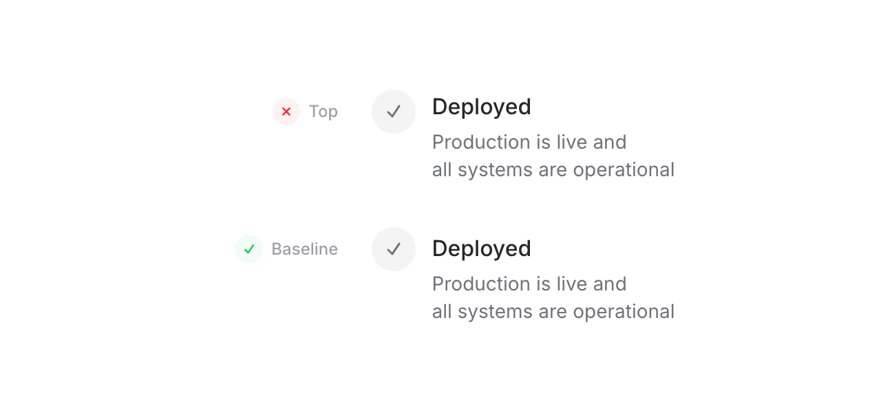 One detail we're particularly proud of: because the timeline uses CSS grid, we can align indicators to the **baseline** of the adjacent text — not top (too high), not center (too low), but right on the text baseline. For SVG icons, we even render an invisible text element inside the indicator solely to establish a proper baseline. It's a small thing, but it makes a real difference.
```blade
```
## Embed anything with blocks
One detail we're particularly proud of: because the timeline uses CSS grid, we can align indicators to the **baseline** of the adjacent text — not top (too high), not center (too low), but right on the text baseline. For SVG icons, we even render an invisible text element inside the indicator solely to establish a proper baseline. It's a small thing, but it makes a real difference.
```blade
```
## Embed anything with blocks
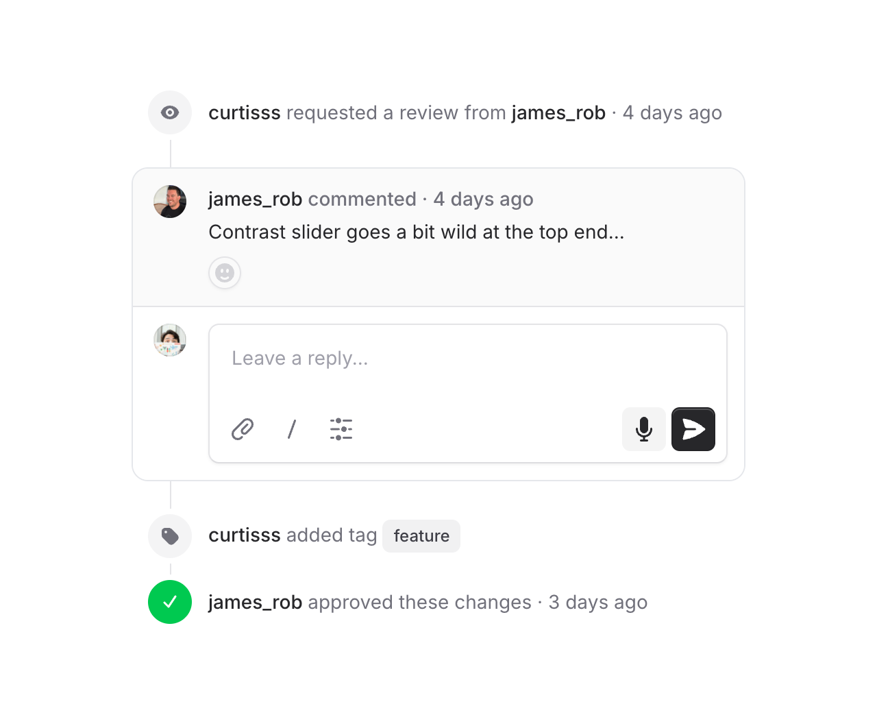 Use `flux:timeline.block` to drop full-width content into the timeline — callouts, cards, comment threads. Blocks go full-bleed while regular items stay slightly inset, so embedded content feels like it truly *belongs* in the flow. Connector lines attach directly to the block edges, and `flux:timeline.subgrid` lets content inside a block snap to the outer timeline's columns using CSS subgrid — so avatars, text, and indicators all stay perfectly aligned.
## Accessibility
And of course, we went to great lengths to make sure this component honors expected keyboard navigation, focus behavior, and proper aria-labels so that screen readers can use it just as well.
---
[Check out the timeline docs →](https://fluxui.dev/components/timeline)
Use `flux:timeline.block` to drop full-width content into the timeline — callouts, cards, comment threads. Blocks go full-bleed while regular items stay slightly inset, so embedded content feels like it truly *belongs* in the flow. Connector lines attach directly to the block edges, and `flux:timeline.subgrid` lets content inside a block snap to the outer timeline's columns using CSS subgrid — so avatars, text, and indicators all stay perfectly aligned.
## Accessibility
And of course, we went to great lengths to make sure this component honors expected keyboard navigation, focus behavior, and proper aria-labels so that screen readers can use it just as well.
---
[Check out the timeline docs →](https://fluxui.dev/components/timeline)