# Color picker
Published: April 17, 2026
Version: ^2.14.0
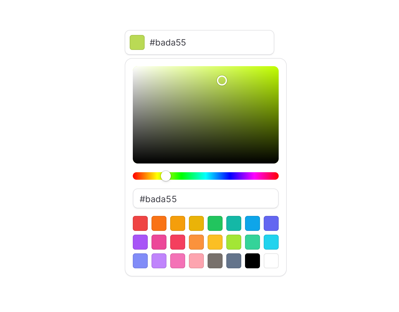 Meet the new snazzy **Color picker** input. Good for theme settings, brand pickers, and anywhere your users need to choose a color.
```blade
```
## Type or paste anything
The default trigger is a text input, and it's surprisingly forgiving about what you throw at it. Hex, RGB, HSL, with or without alpha, spaces, parens, missing `#` — it all just works:
Meet the new snazzy **Color picker** input. Good for theme settings, brand pickers, and anywhere your users need to choose a color.
```blade
```
## Type or paste anything
The default trigger is a text input, and it's surprisingly forgiving about what you throw at it. Hex, RGB, HSL, with or without alpha, spaces, parens, missing `#` — it all just works:
 ## Every format, alpha included
Use the `format` prop to pick your output. Alpha-aware formats automatically render an alpha slider in the popover:
```blade
```
## Bring your own swatches
## Every format, alpha included
Use the `format` prop to pick your output. Alpha-aware formats automatically render an alpha slider in the popover:
```blade
```
## Bring your own swatches
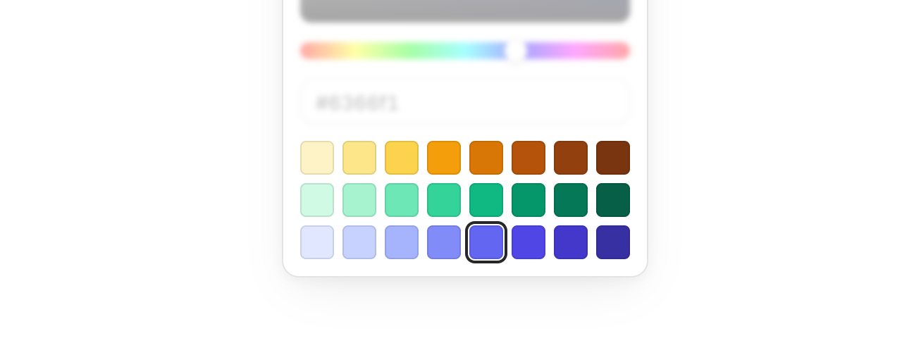 The default palette is 24 Tailwind colors, but swapping in your brand colors is a one-liner. Pass an array of hex values, or `[value, label]` pairs for accessible swatch labels:
```blade
```
## Eye dropper support
The default palette is 24 Tailwind colors, but swapping in your brand colors is a one-liner. Pass an array of hex values, or `[value, label]` pairs for accessible swatch labels:
```blade
```
## Eye dropper support
 Add the `dropper` prop and the picker gets a button that lets users sample a color from anywhere on their screen — a logo, a screenshot, another part of your app:
```blade
```
Under the hood this uses the browser's EyeDropper API. In browsers that don't support it, the button is automatically disabled so nothing breaks.
## Compose your own layout
One of our favorite parts: the popover is fully composable. Every element inside the picker is fully under your control.
```blade
Add the `dropper` prop and the picker gets a button that lets users sample a color from anywhere on their screen — a logo, a screenshot, another part of your app:
```blade
```
Under the hood this uses the browser's EyeDropper API. In browsers that don't support it, the button is automatically disabled so nothing breaks.
## Compose your own layout
One of our favorite parts: the popover is fully composable. Every element inside the picker is fully under your control.
```blade
```
You get `flux:color-picker.area`, `.slider`, `.input`, `.swatches`, `.swatch`, and `.dropper` — mix and match to build a compact swatch-only picker, a canvas-only picker, or anything in between.
## Accessibility
And of course, we went to great lengths to make sure this component honors expected keyboard navigation, focus behavior, and proper aria-labels so that screen readers can use it just as well.
---
[Check out the color picker docs →](https://fluxui.dev/components/color-picker)