
# Carousel

Published: June 4, 2026

Version: ^2.15.0

<img loading="lazy" class="rounded-2xl border dark:border-zinc-700" src="/img/blog/2_15_0_carousel_hero.png" alt="Carousel component showing a full-width image gallery with overlaid text and navigation controls" />

Flux now ships with a **Carousel** component. Image galleries, testimonial rotators, product showcases, featured listings — whatever you need to scroll through, it's ready to go.

Let's take a look.

## Snap and scroll

Drop in a `flux:carousel` with as many slides as you need. Each slide snaps into place naturally, and arrow controls appear automatically — they even hide themselves when you've reached either end:

```blade
<flux:carousel>
    <flux:carousel.slide class="w-full">
        <img src="/img/seascape.png" class="aspect-16/9 rounded-lg object-cover" />
    </flux:carousel.slide>

    <flux:carousel.slide class="w-full">
        <img src="/img/woodscape.png" class="aspect-16/9 rounded-lg object-cover" />
    </flux:carousel.slide>

    <!-- ... -->
</flux:carousel>
```

Slides can be any width — `w-full` for a single-slide gallery, `w-1/3` for a multi-card layout, or responsive classes like `w-4/5 sm:w-1/2 md:w-1/3` to adapt across breakpoints.

## External controls

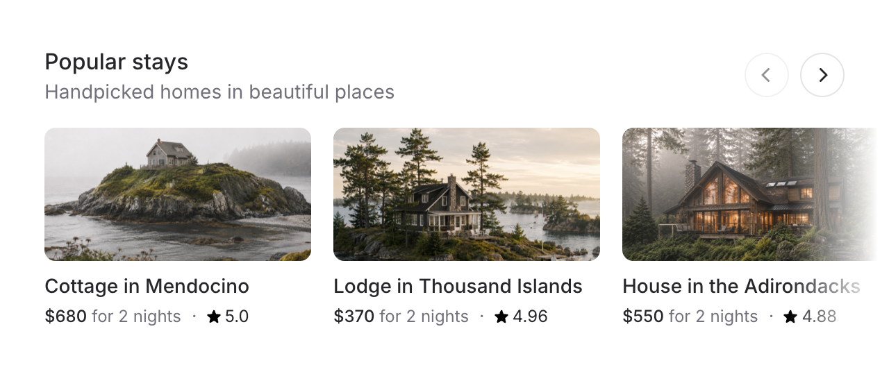
<img loading="lazy" class="rounded-2xl border dark:border-zinc-700" src="/img/blog/2_15_0_carousel_external_controls.png" alt="A card-based carousel with a heading and external arrow controls positioned in the top right" />

For layouts like featured listings or product rows, you probably don't want arrow buttons floating over your content. Use a shared `name` to place controls anywhere on the page:

```blade
<div class="flex justify-between items-center mb-4">
    <div>
        <flux:heading size="lg">Popular stays</flux:heading>
        <flux:text>Handpicked homes in beautiful places</flux:text>
    </div>

    <flux:carousel.controls name="popular-stays" />
</div>

<flux:carousel name="popular-stays" :arrows="false">
    <flux:carousel.slide class="w-4/5 sm:w-1/2 md:w-1/3">
        <!-- ... -->
    </flux:carousel.slide>
</flux:carousel>
```

The controls stay in sync — they disable at the edges just like the built-in arrows would.

## Advance by page

By default, arrow controls move one slide. Set `advance="page"` to jump by however many slides are currently visible — much better for grids with lots of items:

```blade
<flux:carousel advance="page">
    <!-- ... -->
</flux:carousel>
```

## Indicators and autoplay

For simpler carousels like testimonials, swap arrows for dot indicators. Add `autoplay` and the slides advance on their own — pausing automatically on hover or focus:

```blade
<flux:carousel indicators autoplay autoplay:interval="3500">
    <!-- ... -->
</flux:carousel>
```

## Accessibility

And of course, we went to great lengths to make sure this component honors expected keyboard navigation, focus behavior, and proper aria-labels so that screen readers can use it just as well.

---

[Check out the carousel docs →](https://fluxui.dev/components/carousel)
