# Richer select options
Published: August 9, 2026
Version: ^2.16.0
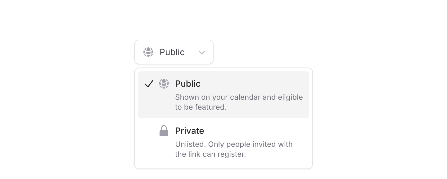 We've made a bunch of improvements to **Select**. Options can now have icons, descriptions, and avatars, and the dropdown itself can be positioned, aligned, and sized independently from the trigger.
Let's take a look.
## Icons and descriptions
Add an `icon` to make options easier to scan, or a `description` when a label needs a little more context. You can use either on its own or combine them:
```blade
```
Descriptions only appear while the dropdown is open, so the selected value stays nice and compact. Icons also support `icon:variant` and `icon:class` for further customization.
## Avatars
We've made a bunch of improvements to **Select**. Options can now have icons, descriptions, and avatars, and the dropdown itself can be positioned, aligned, and sized independently from the trigger.
Let's take a look.
## Icons and descriptions
Add an `icon` to make options easier to scan, or a `description` when a label needs a little more context. You can use either on its own or combine them:
```blade
```
Descriptions only appear while the dropdown is open, so the selected value stays nice and compact. Icons also support `icon:variant` and `icon:class` for further customization.
## Avatars
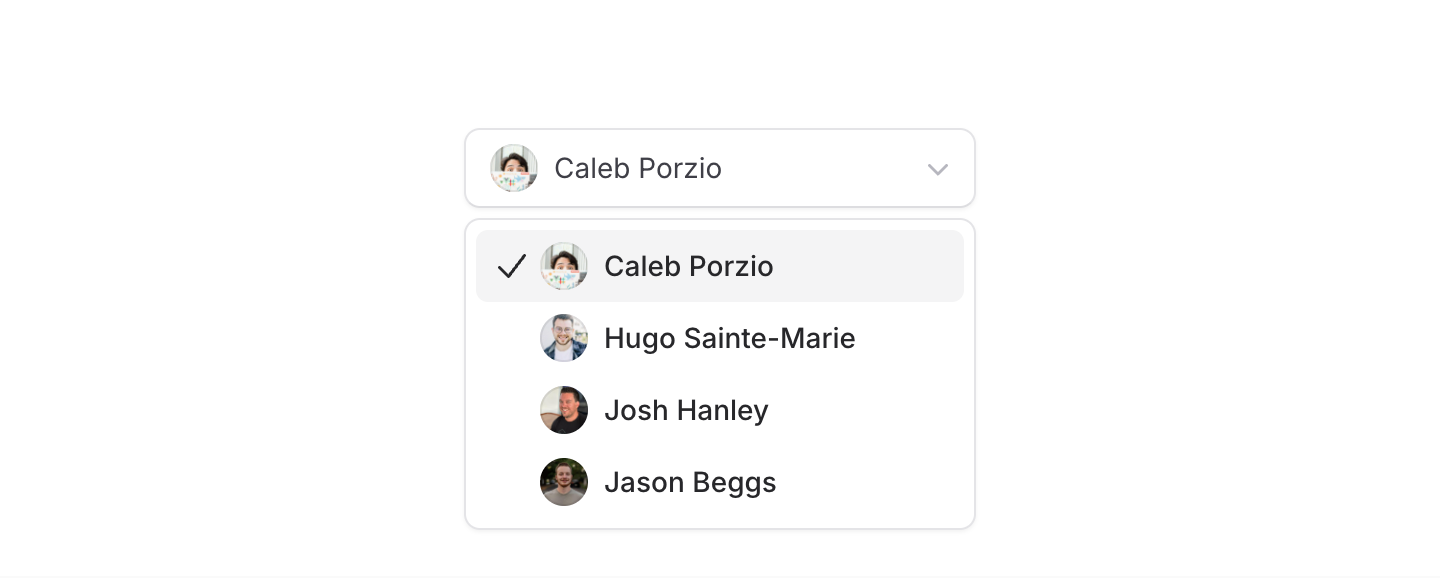 For user pickers, pass an image URL to the new `avatar` prop:
```blade
```
You can pass `avatar:*` props straight through to the underlying Avatar component when you need more control.
Select components are one of the hardest things to get right in a UI kit, and we're proud of how flexible and capable Flux's select has become!
---
[Check out the select docs →](https://fluxui.dev/components/select)
For user pickers, pass an image URL to the new `avatar` prop:
```blade
```
You can pass `avatar:*` props straight through to the underlying Avatar component when you need more control.
Select components are one of the hardest things to get right in a UI kit, and we're proud of how flexible and capable Flux's select has become!
---
[Check out the select docs →](https://fluxui.dev/components/select)