# Colored buttons
Published: September 7, 2026
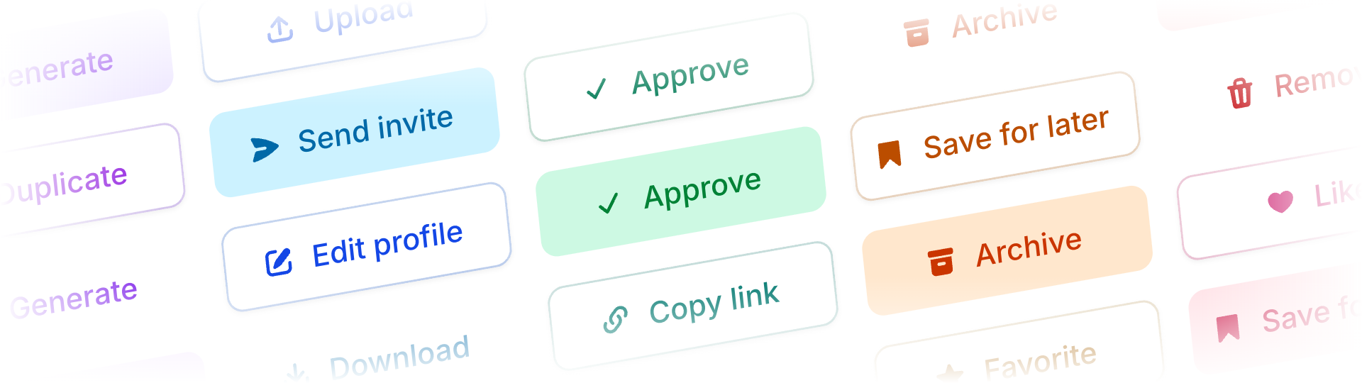 Flux's `filled`, `outline`, `ghost`, and `subtle` buttons now support color, alongside `primary`. You can give an action a color without making it the loudest thing on the page.
Just add `color` with a standard Tailwind color name:
```blade
Edit profile
```
That's the default outline button. Swap the variant to change the emphasis:
```blade
Approve
Remove
View details
```
I'm particularly happy with the outlines. They keep the familiar surface and shadow, with color softly mixed into the label, border, and hover state. They still feel at home next to a regular Flux button.
Flux's `filled`, `outline`, `ghost`, and `subtle` buttons now support color, alongside `primary`. You can give an action a color without making it the loudest thing on the page.
Just add `color` with a standard Tailwind color name:
```blade
Edit profile
```
That's the default outline button. Swap the variant to change the emphasis:
```blade
Approve
Remove
View details
```
I'm particularly happy with the outlines. They keep the familiar surface and shadow, with color softly mixed into the label, border, and hover state. They still feel at home next to a regular Flux button.
 Ghost keeps a colored label on a transparent background. Subtle starts muted and brings out the color on hover. Small differences, but useful when you're deciding how much attention an action needs.
Neutral colors keep the default styling outside of `primary`.
[Check out the button docs →](https://fluxui.dev/components/button#colors)
Ghost keeps a colored label on a transparent background. Subtle starts muted and brings out the color on hover. Small differences, but useful when you're deciding how much attention an action needs.
Neutral colors keep the default styling outside of `primary`.
[Check out the button docs →](https://fluxui.dev/components/button#colors)