The Changelog
What's new around here?
Succinct and informative updates about Flux.
September 8, 2026
Pie charts
Version ^2.19.0
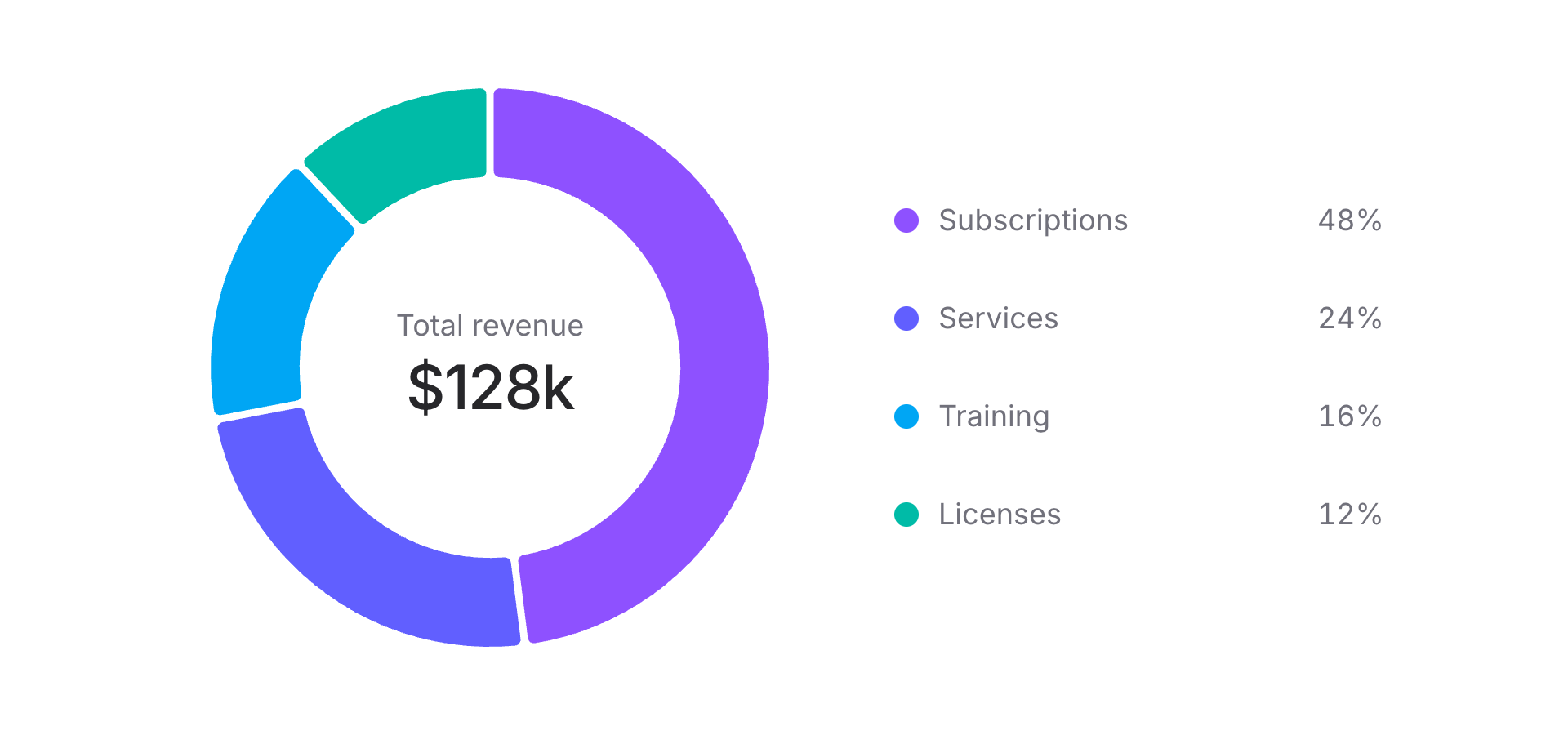
Flux charts now support pies and donuts. Here’s what a basic pie chart looks like:
Copy to clipboard
<flux:chart wire:model="data" class="aspect-square"> <flux:chart.svg> <flux:chart.pie field="value" label-field="label" /> </flux:chart.svg></flux:chart>Each row in $data becomes a slice. Give it a label and a numeric value, and Flux handles the proportions and colors.
Tooltips that follow the slice
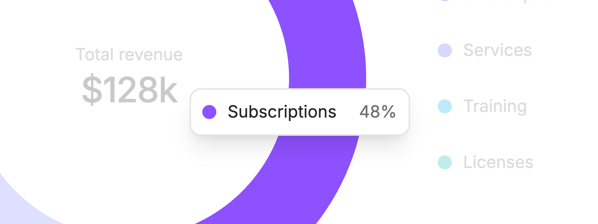
To let someone hover a slice and see its name and value, add a tooltip inside your chart:
Copy to clipboard
<flux:chart.tooltip> <flux:chart.tooltip.value field="value" label-field="label"> <flux:chart.tooltip.indicator /> </flux:chart.tooltip.value></flux:chart.tooltip>The same tooltip row works for every slice: label-field picks up its name, and the little indicator dot matches its color.
The little details
I wanted it to be easy to keep track of a slice as your data changes, so colors stay with their slices. Flux uses each row's id, or its label when there's no ID. Sorting your data or removing a row won't shuffle the remaining colors, and you can set a row's color yourself if you already have a palette in mind.
You can help someone follow a slice while they're hovering, too. Flux marks the hovered slice as active and the others as inactive, leaving the styling up to you. For example, these classes gently dim the other slices:
Copy to clipboard
class="transition-opacity data-inactive:opacity-40"To try these options together, pick the Pie preset in the interactive chart builder. You can tweak the chart there, then copy the Blade into your app.