The Changelog
What's new around here?
Succinct and informative updates about Flux.
October 8, 2025
Sticky table headers + columns
Version ^2.5.1
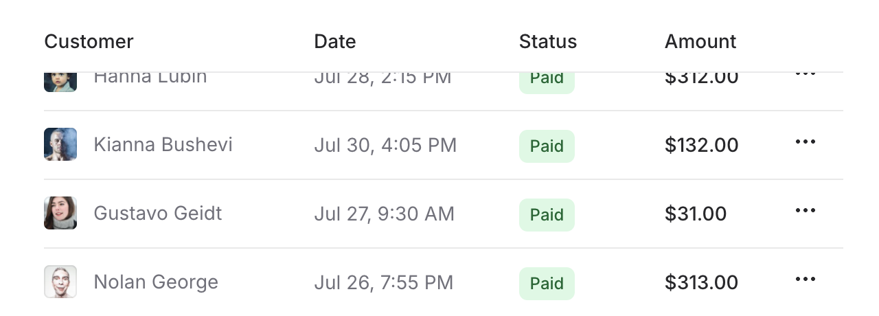
Flux tables now support sticky headers and sticky columns, making it easy to keep important information visible while users scroll through large datasets.
Let's take a look.
Sticky headers
Keep column headers visible during vertical scrolling by adding the sticky prop to your table.columns component:
Copy to clipboard
<flux:table container:class="max-h-80"> <flux:table.columns sticky class="bg-white dark:bg-zinc-900"> <flux:table.column>Customer</flux:table.column> <flux:table.column>Date</flux:table.column> <flux:table.column>Status</flux:table.column> <flux:table.column>Amount</flux:table.column> </flux:table.columns> <!-- ... --></flux:table>The background color on the header row prevents content overlap as rows scroll underneath. The container:class prop lets you set a maximum height for your table, creating a scrollable area while keeping the headers locked in place.
Sticky columns
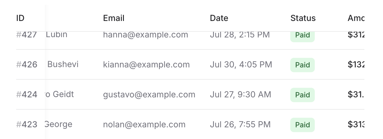
Keep important columns visible during horizontal scrolling by adding the sticky prop to individual table.column and table.cell components. Combine it with sticky headers for a spreadsheet-like experience:
Copy to clipboard
<flux:table container:class="max-h-80"> <flux:table.columns sticky class="bg-white dark:bg-zinc-900"> <flux:table.column sticky class="bg-white dark:bg-zinc-900">ID</flux:table.column> <flux:table.column>Customer</flux:table.column> <flux:table.column>Email</flux:table.column> <!-- ... --> </flux:table.columns> <flux:table.rows> @foreach ($this->orders as $order) <flux:table.row :key="$order->id"> <flux:table.cell sticky class="bg-white dark:bg-zinc-900">{{ $order->id }}</flux:table.cell> <flux:table.cell>{{ $order->customer }}</flux:table.cell> <flux:table.cell>{{ $order->email }}</flux:table.cell> <!-- ... --> </flux:table.row> @endforeach </flux:table.rows></flux:table>Apply sticky to both the column header and the corresponding cells in each row. Add background colors to prevent content overlap, and we'll automatically add a subtle shadow when scrolling to help users see that the column is overlaying content underneath.
Check out the Table documentation for complete examples and API reference.
September 30, 2025
File upload
Version ^2.5.0
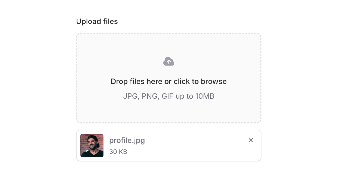
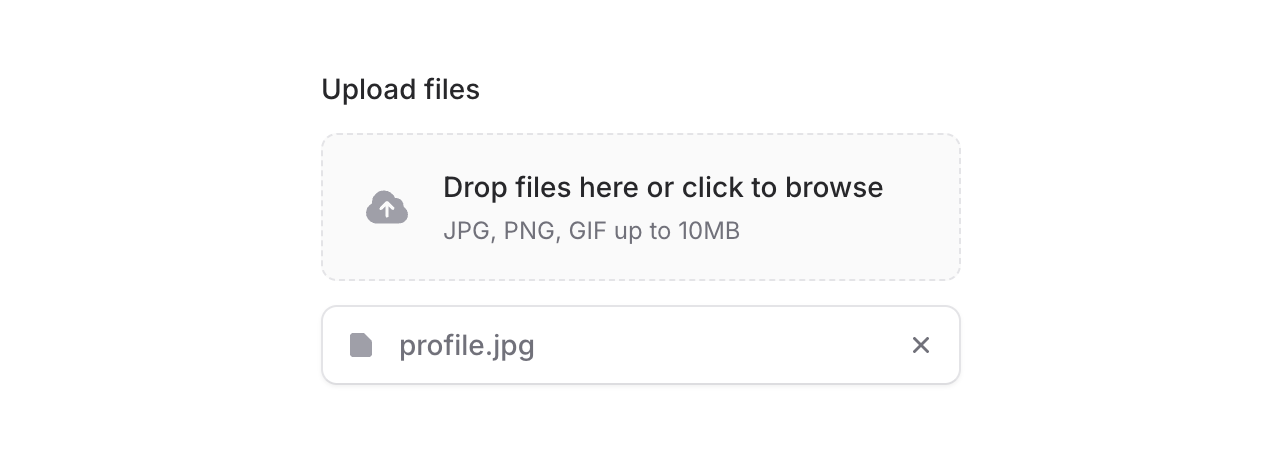
Flux now ships with a complete File Upload component built for modern file handling. Drag and drop, progress tracking, file previews—it all works beautifully right out of the box.
Copy to clipboard
<flux:file-upload wire:model="photos" multiple> <flux:file-upload.dropzone heading="Drop files here or click to browse" text="JPG, PNG, GIF up to 10MB" /></flux:file-upload>Drag and drop
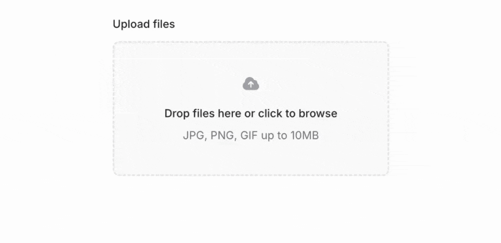
The file upload component handles drag and drop automatically. Users can drag files directly from their desktop, or click to browse—whatever they prefer. The component automatically provides visual feedback when files are dragged over using data attributes you can style with Tailwind's in-data-dragging: prefix.
Compact inline layout
For tighter spaces, add the inline prop to the dropzone for a horizontal layout that takes up less vertical room:
Copy to clipboard
<flux:file-upload.dropzone heading="Drop files or click to browse" text="JPG, PNG, GIF up to 10MB" inline/>Built-in progress tracking

Add the with-progress prop and the component shows real-time upload progress. No extra JavaScript needed—it's all handled for you.
Copy to clipboard
<flux:file-upload.dropzone heading="Drop files or click to browse" text="JPG, PNG, GIF up to 10MB" with-progress/>The component exposes CSS variables (--flux-file-upload-progress and --flux-file-upload-progress-as-string) so you can create custom progress indicators if you need them.
Completely customizable

The flux:file-upload wrapper handles all the complex functionality—drag and drop, file selection, upload progress—while letting you use any custom HTML you want for the appearance. This is perfect for things like custom avatar uploaders or specialized file inputs.
Copy to clipboard
<flux:file-upload wire:model="photo"> <!-- Your custom UI here --> <div class="..."> <flux:icon name="user" /> </div></flux:file-upload>The component provides data-dragging and data-loading attributes that you can target with Tailwind's utility prefixes for dynamic visual feedback.
Display uploaded files
The flux:file-item component displays uploaded files with automatic image previews, formatted file sizes, and action buttons. It handles all the details—file name display, size formatting (KB, MB, GB), and thumbnail generation.
Copy to clipboard
@foreach ($photos as $index => $photo) <flux:file-item :heading="$photo->getClientOriginalName()" :image="$photo->temporaryUrl()" :size="$photo->getSize()" > <x-slot name="actions"> <flux:file-item.remove wire:click="removePhoto({{ $index }})" /> </x-slot> </flux:file-item>@endforeachSeamless Livewire integration
Works perfectly with Livewire's file upload system. Just add wire:model and you're done—single files, multiple files, validation, temporary URLs, it all just works.
The documentation includes complete examples for both single and multiple file uploads with full Livewire component code.
Works as a native file input
The file upload component dispatches all the same events and has all the same properties as a native <input type="file"> element. This means you can likely use it with your favorite third-party library.
Accessibility built in
We made sure the file upload component works great on both mobile devices and screen readers. All interactive elements have proper ARIA labels, keyboard navigation works exactly as you'd expect, and focus management is handled automatically.
Check out the File Upload documentation for complete examples and API reference.
September 15, 2025
Pillbox
Version ^2.4.0
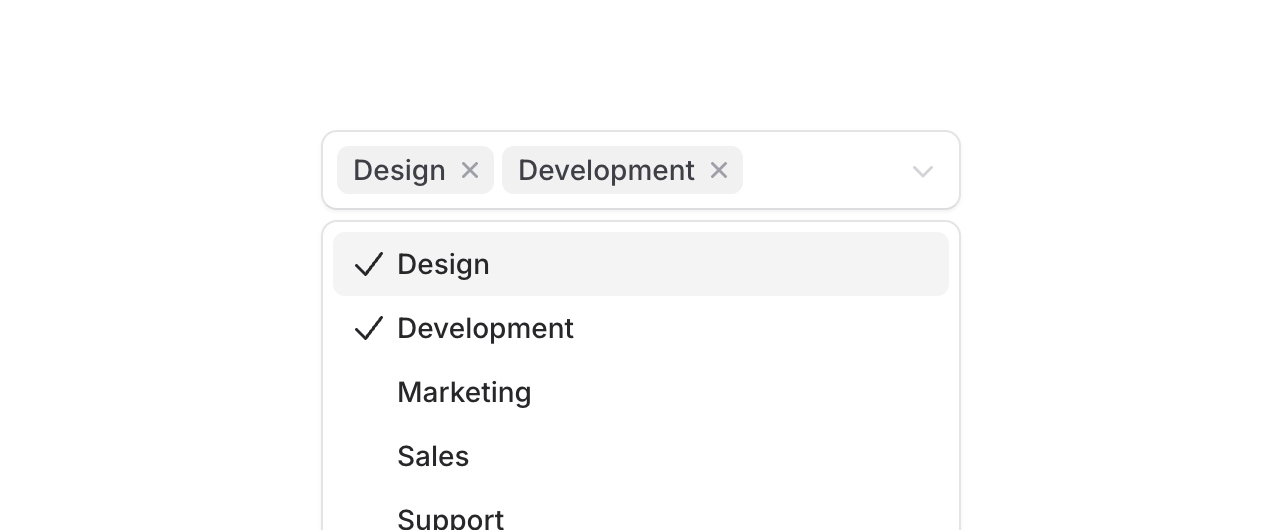
Introducing Pillbox, a select component that displays selected items as removable pills right inside the input area. Perfect for tagging systems, skill selectors, or any multi-select scenario where you want selected values to be front and center.
Unlike traditional multi-selects that hide selections in a dropdown, Pillbox shows everything at a glance with each selection becoming a removable pill that expands the input area as needed.
Copy to clipboard
<flux:pillbox wire:model="tags" multiple placeholder="Choose tags..."> <flux:pillbox.option value="design">Design</flux:pillbox.option> <flux:pillbox.option value="development">Development</flux:pillbox.option> <flux:pillbox.option value="marketing">Marketing</flux:pillbox.option></flux:pillbox>Search through options
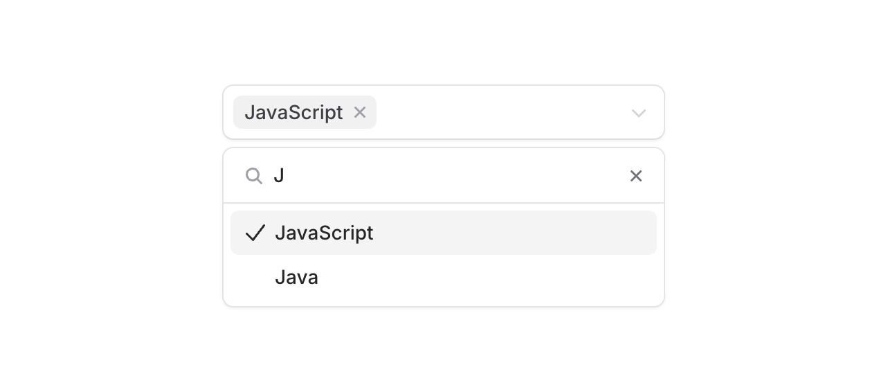
Add the searchable prop to filter through large lists. The search input appears right in the dropdown, making it easy to find exactly what you're looking for.
Copy to clipboard
<flux:pillbox multiple searchable placeholder="Choose skills..."> <flux:pillbox.option value="javascript">JavaScript</flux:pillbox.option> <flux:pillbox.option value="typescript">TypeScript</flux:pillbox.option> <flux:pillbox.option value="php">PHP</flux:pillbox.option> <!-- ... --></flux:pillbox>The details
We built Pillbox to handle the real-world complexity of multi-select inputs:
Visual feedback: Each pill has its own remove button, making it clear how to deselect individual items. The input area expands naturally as you add more pills.
Accessible by default: Screen readers announce selected items, available options, and state changes. ARIA attributes are handled automatically.
Custom content: Options aren't limited to text. Add icons or custom HTML to make options more recognizable.