The Changelog
What's new around here?
Succinct and informative updates about Flux.
RSS feed
August 8, 2026
Dot ticks for sliders
Version ^2.16.0

Flux sliders can now display dot ticks directly inside the track. They're handy for compact settings, ratings, and other controls with a small set of meaningful steps.
Copy to clipboard
<flux:slider tick:position="inside" min="1" max="5"> @foreach (range(1, 5) as $i) <flux:slider.tick :value="$i" variant="dot" /> @endforeach</flux:slider>The two new options are intentionally independent: tick:position="inside" controls where the slider renders its ticks, while variant="dot" controls how each tick looks.
That means you can mix and match them. Dot ticks can sit below the track, and regular line ticks can sit inside it. Custom tick labels continue to work below the slider as before.
Dots also inherit the slider's active state, so marks over the filled portion of the track automatically adjust their contrast as the value changes.
June 4, 2026
Carousel
Version ^2.15.0

Flux now ships with a Carousel component. Image galleries, testimonial rotators, product showcases, featured listings — whatever you need to scroll through, it's ready to go.
Let's take a look.
Snap and scroll
Drop in a flux:carousel with as many slides as you need. Each slide snaps into place naturally, and arrow controls appear automatically — they even hide themselves when you've reached either end:
Copy to clipboard
<flux:carousel> <flux:carousel.slide class="w-full"> <img src="/img/seascape.png" class="aspect-16/9 rounded-lg object-cover" /> </flux:carousel.slide> <flux:carousel.slide class="w-full"> <img src="/img/woodscape.png" class="aspect-16/9 rounded-lg object-cover" /> </flux:carousel.slide> <!-- ... --></flux:carousel>Slides can be any width — w-full for a single-slide gallery, w-1/3 for a multi-card layout, or responsive classes like w-4/5 sm:w-1/2 md:w-1/3 to adapt across breakpoints.
External controls
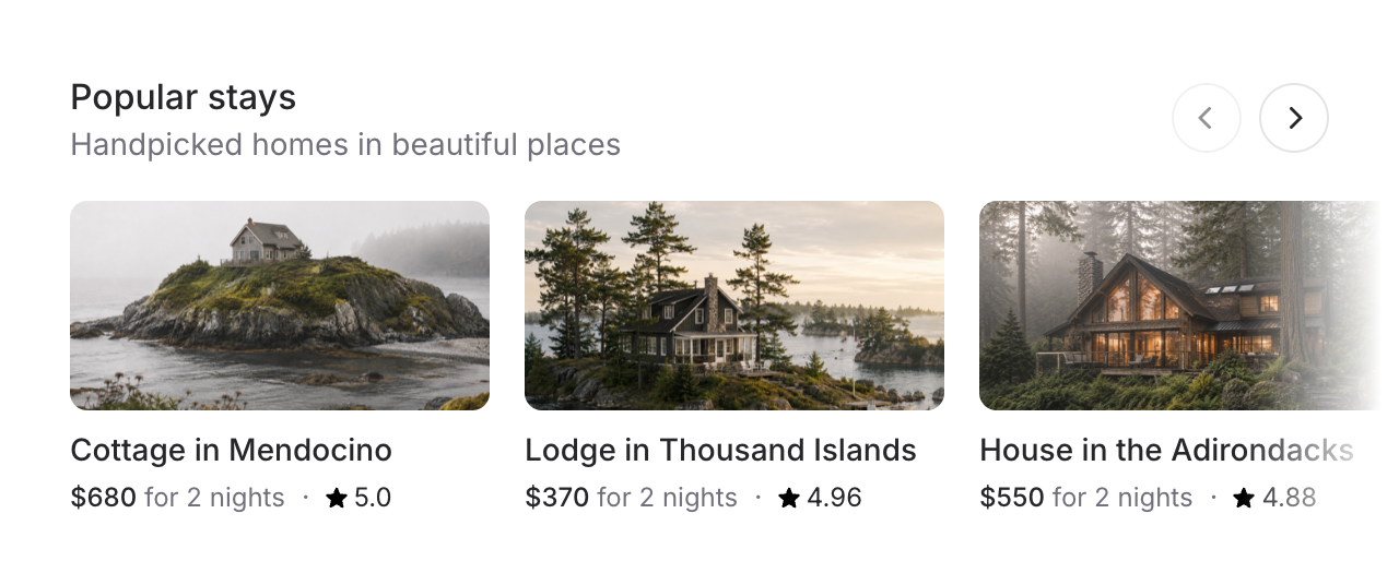
For layouts like featured listings or product rows, you probably don't want arrow buttons floating over your content. Use a shared name to place controls anywhere on the page:
Copy to clipboard
<div class="flex justify-between items-center mb-4"> <div> <flux:heading size="lg">Popular stays</flux:heading> <flux:text>Handpicked homes in beautiful places</flux:text> </div> <flux:carousel.controls name="popular-stays" /></div><flux:carousel name="popular-stays" :arrows="false"> <flux:carousel.slide class="w-4/5 sm:w-1/2 md:w-1/3"> <!-- ... --> </flux:carousel.slide></flux:carousel>The controls stay in sync — they disable at the edges just like the built-in arrows would.
Advance by page
By default, arrow controls move one slide. Set advance="page" to jump by however many slides are currently visible — much better for grids with lots of items:
Copy to clipboard
<flux:carousel advance="page"> <!-- ... --></flux:carousel>Indicators and autoplay
For simpler carousels like testimonials, swap arrows for dot indicators. Add autoplay and the slides advance on their own — pausing automatically on hover or focus:
Copy to clipboard
<flux:carousel indicators autoplay autoplay:interval="3500"> <!-- ... --></flux:carousel>Accessibility
And of course, we went to great lengths to make sure this component honors expected keyboard navigation, focus behavior, and proper aria-labels so that screen readers can use it just as well.
April 17, 2026
Color picker
Version ^2.14.0
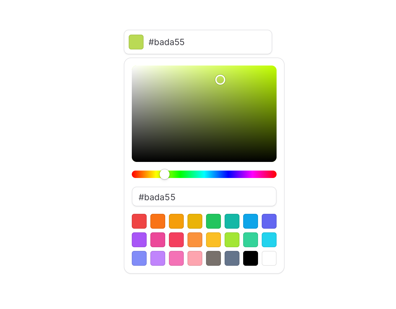
Meet the new snazzy Color picker input. Good for theme settings, brand pickers, and anywhere your users need to choose a color.
Copy to clipboard
<flux:color-picker wire:model="theme" />Type or paste anything
The default trigger is a text input, and it's surprisingly forgiving about what you throw at it. Hex, RGB, HSL, with or without alpha, spaces, parens, missing # — it all just works:

Every format, alpha included
Use the format prop to pick your output. Alpha-aware formats automatically render an alpha slider in the popover:
Copy to clipboard
<flux:color-picker format="hex" /><flux:color-picker format="hexa" /><flux:color-picker format="rgb" /><flux:color-picker format="rgba" /><flux:color-picker format="hsl" /><flux:color-picker format="hsla" />Bring your own swatches
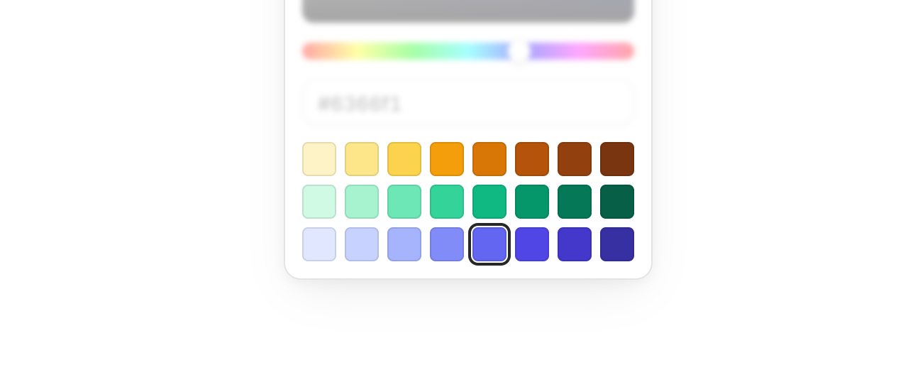
The default palette is 24 Tailwind colors, but swapping in your brand colors is a one-liner. Pass an array of hex values, or [value, label] pairs for accessible swatch labels:
Copy to clipboard
<flux:color-picker :swatches="['#ef4444', '#22c55e', '#3b82f6', '#f59e0b', '#a855f7']" /><flux:color-picker :swatches="[['#ef4444', 'Red'], ['#22c55e', 'Green'], ['#3b82f6', 'Blue']]" />Eye dropper support

Add the dropper prop and the picker gets a button that lets users sample a color from anywhere on their screen — a logo, a screenshot, another part of your app:
Copy to clipboard
<flux:color-picker dropper />Under the hood this uses the browser's EyeDropper API. In browsers that don't support it, the button is automatically disabled so nothing breaks.
Compose your own layout
One of our favorite parts: the popover is fully composable. Every element inside the picker is fully under your control.
Copy to clipboard
<flux:color-picker> <div class="flex flex-col gap-3"> <flux:color-picker.input placeholder="#000000" /> <flux:separator /> <flux:color-picker.area /> <flux:color-picker.slider channel="hue" /> </div></flux:color-picker>You get flux:color-picker.area, .slider, .input, .swatches, .swatch, and .dropper — mix and match to build a compact swatch-only picker, a canvas-only picker, or anything in between.
Accessibility
And of course, we went to great lengths to make sure this component honors expected keyboard navigation, focus behavior, and proper aria-labels so that screen readers can use it just as well.