The Changelog
What's new around here?
Succinct and informative updates about Flux.
February 17, 2025
Flux 2 is here
Version ^2.x
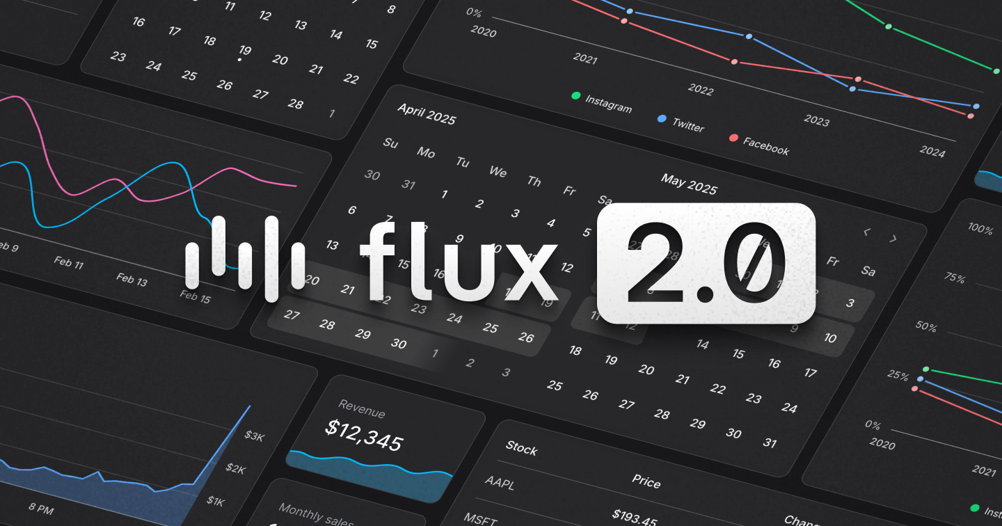
What started as a curiosity—building a date picker from scratch—turned into months of focused work dreaming and building the next version of Flux. Complete with date pickers, calendars, charts, and more.
Today, we're proud to release: Flux v2
Flux v2 brings powerful new components while staying lean and dependency-free. This release includes:
- A lightweight date picker & calendar
- Line & area charts for analytics
- Full Tailwind 4 support
- A free tier with essential UI components
- Laravel starter kits for instant productivity
Let's go.
Zero added dependencies
Keeping Flux lightweight was a top priority. Instead of pulling in third-party date pickers and charts, we built our own from the ground up—resulting in only 13kb added to the bundle.
Why go through all that trouble for a few extra kilobytes?
While exploring third-party charting and date picker libraries, we kept running into the following:
- Too much complex configuration
- Difficulty styling to match our designs
- Lack of accessibility & localization
With that, we decided to roll up our sleeves and build it all ourselves. And we're glad we did, because now we have the exact components we want for our use cases and nothing more. On top of that, when we encounter things we'd like added or modified in the future, we can just make it happen. No plugins, no pull requests, just changing our own code.
The date picker
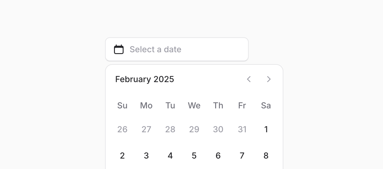
Date pickers are everywhere—but most libraries are bloated and hard to style. With Flux v2, adding a sleek, fully accessible date picker is as simple as:
Copy to clipboard
<flux:date-picker />Of course, like any component in Flux, we went the extra mile to make sure this component is:
- Mobile Friendly
- Keyboard accessible
- Internationalized
A calendar component
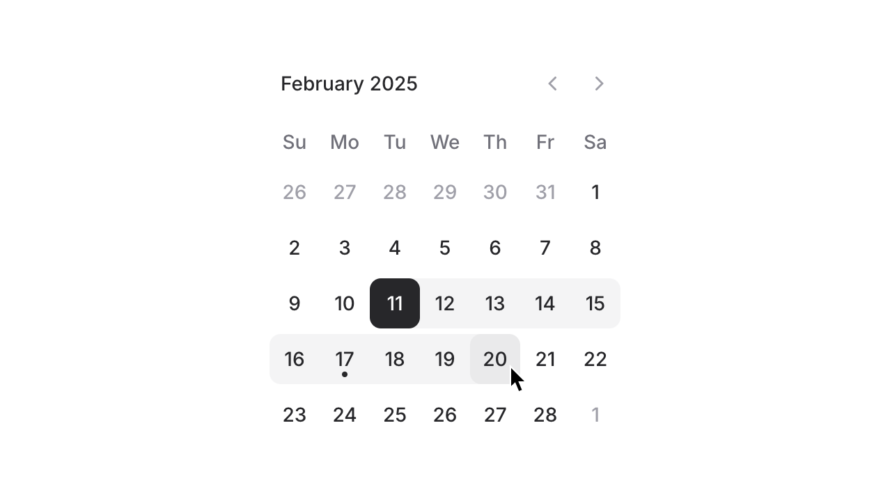
Date pickers are great, but sometimes you may want to embed the calendar itself on the page to allow users to choose a date for something like an appointment. We've seen this pattern a lot on sites like Shopify and AirBnB.
With our dedicated Calendar component you can now allow users to choose dates without hiding the calendar inside a dropdown:
Copy to clipboard
<flux:calendar />The date range picker
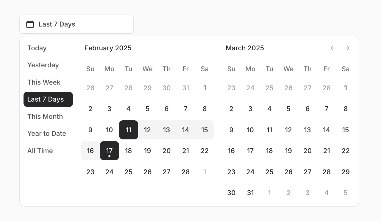
Date range pickers are an essential part of any analytics or booking interface. Therefore we didn't hold back when building ours.
You can simply add mode="range" to any date picker or calendar to support ranges, or you can go all out with presets, input fields, and plenty more options:
Copy to clipboard
<flux:date-picker mode="range" months="2" with-presets />Charts
Just like the date picker, a charting library is something we never thought we'd build from scratch...but once we started playing around, we started seeing a vision for how we could do charting differently and had to see it through.
They’re Just SVGs
This library is unique in that it makes you feel like you’re simply building and styling an SVG yourself.
This means the syntax for building a chart is slightly more verbose than other Flux components, but the experience is incredible—you won’t feel like you’re learning a mountain of complex configuration schemas. Instead, it’ll feel like you’re just tinkering with some <div>s and Tailwind classes.
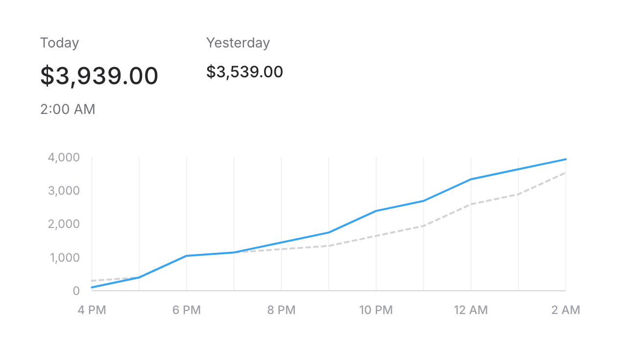
To demonstrate, take a look at the following "Sparkline" chart in Flux:
Here is the markup required to create the above chart:
Copy to clipboard
<flux:chart wire:model="data" class="min-h-32"> <flux:chart.svg> <flux:chart.line class="text-blue-500" stroke="currentColor" stroke-width="2" /> </flux:chart.svg></flux:chart>The above snippet renders, essentially, the following HTML:
Copy to clipboard
<div class="min-h-32"> <svg viewBox="..."> <path d="..." class="text-blue-500" stroke="currentColor" stroke-width="2" /> </svg></div>As you can see, each chart component maps directly to an HTML or SVG element. This means have FULL control over how your chart looks and how it's rendered.
Of course you can copy and paste our charting examples from the docs if you just want to get up and running, but after becoming familiar with the API, you'll have full control to do whatever you want.
Composable
One of my favorite things about this charting tool is its composability. You can mix and match different chart components to create exactly what your app demands.
For example, consider the following code:
Copy to clipboard
<!-- Line on top --><flux:chart.area class="text-blue-500/50" /><flux:chart.line class="text-blue-500" /><!-- Area on top --><flux:chart.line class="text-blue-500" /><flux:chart.area class="text-blue-500/50" />Rendering order is intuitive—just like stacking divs. Whatever appears last will be drawn on top.
Because most of our chart components are actually rendering SVG markup, you can control things intuitively that would have otherwise been an entirely separate configuration item.
Tailwind 4
Tailwind 4 simplifies configuration by allowing customization directly in CSS. Flux takes advantage of this to include its own styles and default configuration effortlessly:
Copy to clipboard
@import 'tailwindcss';@import '../../vendor/livewire/flux/dist/flux.css';This feels much lighter and cleaner to us than the previous approach in Flux v1: A @fluxStyles directive along with additional configuration in tailwind.config.js.
Of course, there are heaps of other goodies in Tailwind 4 that compelled us to switch.
One teeny tiny example is not needing square brackets when styling elements based on data attributes (a pattern we use A LOT):
Copy to clipboard
<!-- Tailwind 3: --><div class="data-[checked]:bg-zinc-800"><!-- Tailwind 4: --><div class="data-checked:bg-zinc-800">Improved dark mode control
For dark mode to work in Flux, a .dark class needs to be added and removed from your app's <html> element.
Rather than doing this yourself in v1, Flux handled this automatically for you.
However, we've heard from users that, although that's nice most of the time, sometimes you want full control over your dark mode setup.
Therefore, in v2, we've removed our automatic handling of dark mode in favor of a new dedicated attribute called @fluxAppearance:
Copy to clipboard
... @fluxAppearance</head>Now, you can easily disable dark mode in your app entirely by simply not including this directive.
Or, if you want to control the .dark class based on something like server-side database code, you can do so yourself freely as well.
Laravel starter kits + new free tier
Flux is now officially part of Laravel’s new starter kits launching next week!
To make this possible, we've beefed up our free tier by including all the essentials you need in a basic web app. Things like buttons, modals, dropdowns, form inputs, etc.
The rest of Flux's more advanced and capable components will be separated out into a dedicated Pro tier.
Of course, all previous purchases will be grandfathered into the pro tier.
Livewire has always been an incredibly productive way to write web apps, but the front-end component landscape just wasn't up to par. Flux has been our mission to resolve this disparity, and now with Flux 2 we feel like the foundation is set.
And we’re just getting started—tons of new components and templates are coming soon. Stay tuned!
-Caleb
December 17, 2024
Theming in Flux
Version ^1.1.0
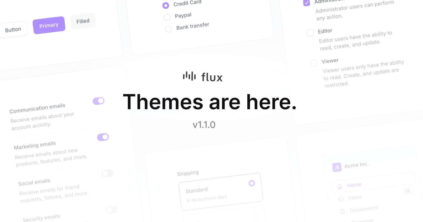
Don't want your Flux app looking like everybody else's? We've got you covered. Flux is now completely themeable!
Three colors, one accent
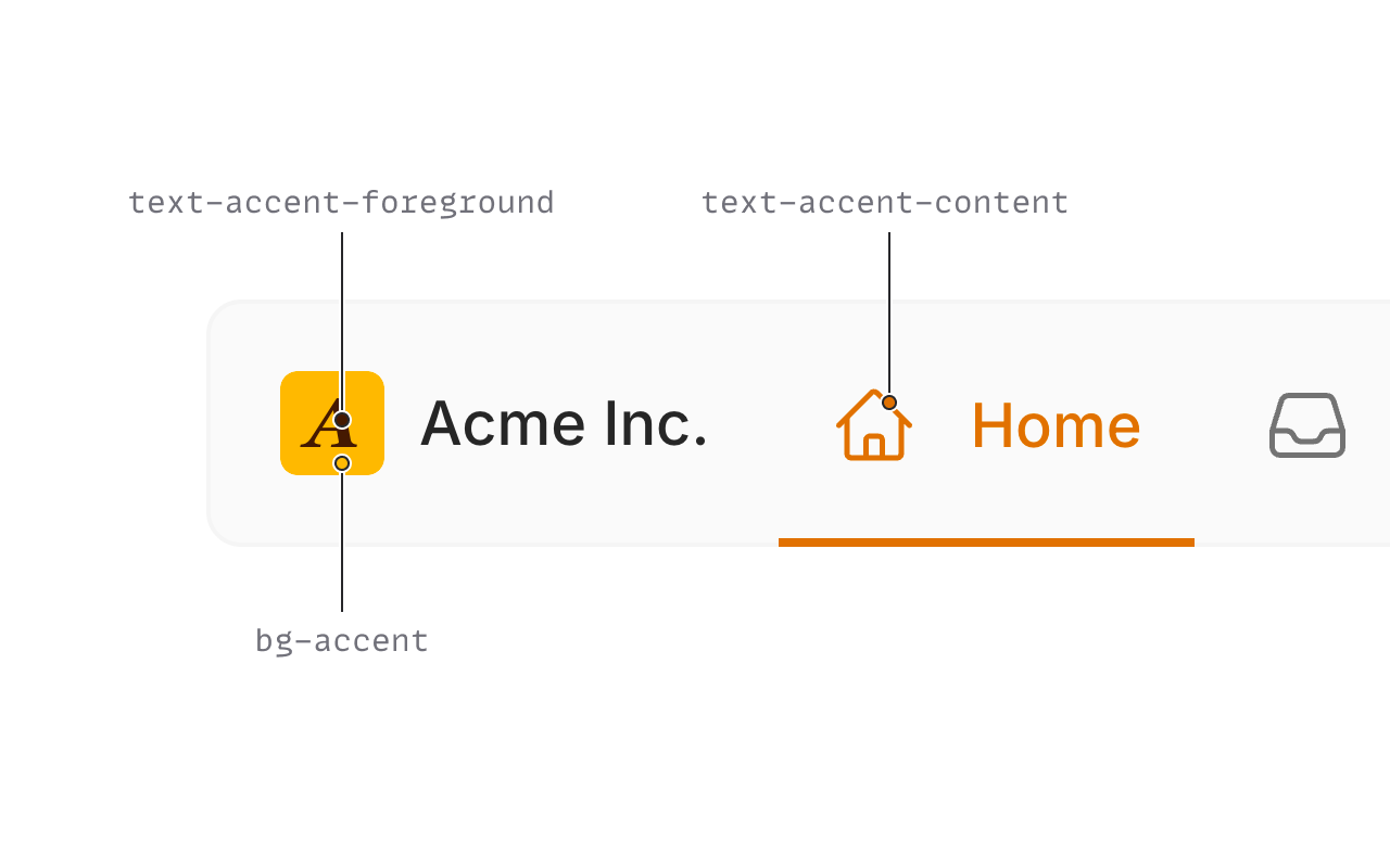
In a perfect world, you could pick a single accent color to theme your entire app. Unfortunately, we found this to be a pipe dream. Instead, we've learned you need no fewer than three accent colors in a system that can support every hue:
- The base accent color. Used for things like the primary button background
- A foreground color. This sits on-top of the base accent color; often used in text.
- A content color. A stronger variant of the accent color for thinner figures like text.
We can then tweak those colors using opacity or color-mix() for specific needs, but those are the three core colors to work off of.
Hand picked colors
We've curated themes for every color in the Tailwind color palette. Each combination is hand selected to make sure it looks just right.
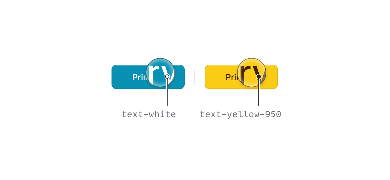
For example, we chose a dark foreground color, instead of white, when an accent color like yellow is too light to meet color contrast standards.
Dark mode
Of course each theme has dark mode baked in, but this is not your mother's dark mode.
There are plenty of places where we went a completely different route stylistically to make sure all designs "feel" the same in both light and dark mode.
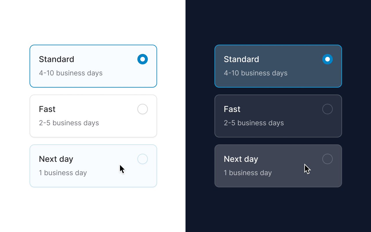
One example is when you hover over a radio card in light mode, the background and border are set to a subtle hue of your accent color, however, in dark mode, the card is just a lighter shade of gray.
This is because when you add color to an element in light mode it looks lighter and therefore closer to the user. But when you add color to an element in dark mode, it looks DARKER, and therefore further from the user and more blended with the background. In these cases, we've mixed the color with extra white—using transparency—or left the color out completely.
Opt-out
Some components are themed by default that you may want to render as a base color instead.
In these cases, we've added an accent prop that you can use to opt-out of the themed version.
Here's an example of rendering a link in black/white instead of your accent color:
Copy to clipboard
<flux:link :accent="false">Profile</flux:tab>Choose your gray
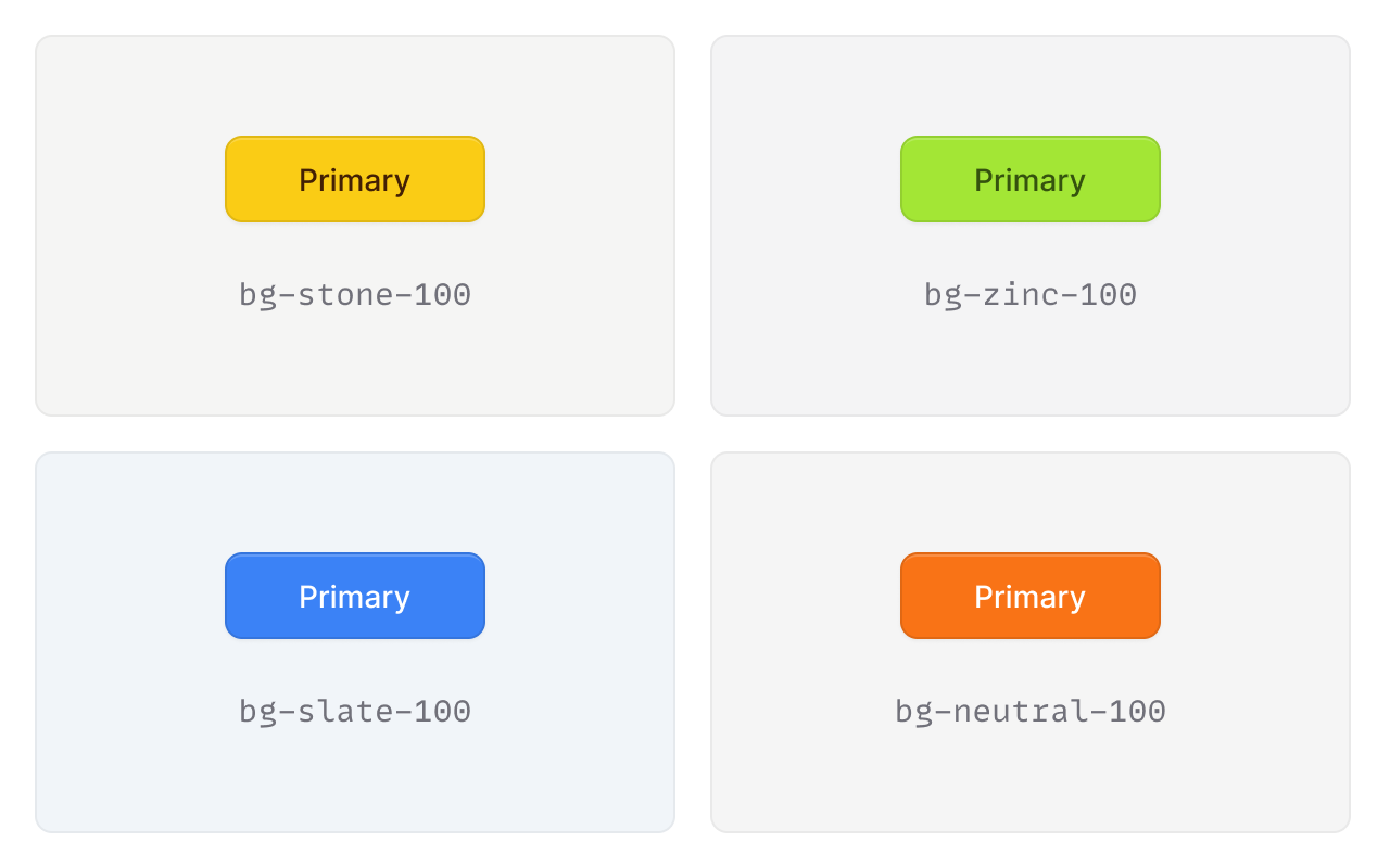
Flux ships with zinc as its gray hue of choice. This looks clean and modern with its black and white design, however, it's not always the best choice for other accent colors.
We've pre-selected which gray colors look best in combination with certain accent colors. You can simply select an accent color in the theme builder, and we will adapt the gray to match.
Of course, you can also choose your own gray if you have a different preference.
CSS Variables
Copy to clipboard
@layer base { :root { --color-accent: var(--color-amber-400); --color-accent-content: var(--color-amber-600); --color-accent-foreground: var(--color-amber-950); } .dark { --color-accent: var(--color-amber-400); --color-accent-content: var(--color-amber-400); --color-accent-foreground: var(--color-amber-950); }}We are using CSS variables for all accent colors so they can be easily customized in any way you please.
We've also chosen variable names that adhere to Tailwind 4's naming convention. This way, in Tailwind 4, you won't need to add any configuration to use them in your utilities like bg-accent.
You'll also notice these variables are adaptive, meaning they will change their values automatically in dark mode so that you don't have to do things like: bg-accent dark:bg-accent-dark.
Tailwind 4, here we come
With Tailwind 4 right around the corner, we wanted to make sure we taking advantage of all the goodness it has to offer as well as using conventions like the aforementioned variable names.
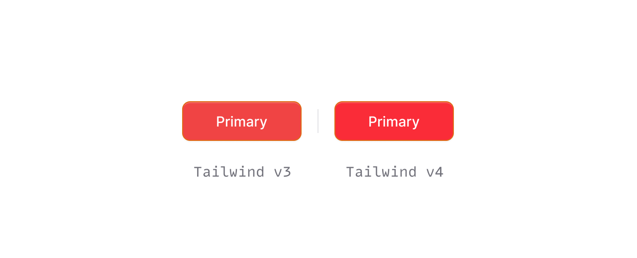
Tailwind 4 uses a more modern color space for its color palette called oklab instead of the standard srgb (hsa(), rgb(), etc.) that you're used to.
Here is the difference between bg-red-500 in Tailwind 3 vs Tailwind 4:
Copy to clipboard
/* Tailwind 3 */--color-red-500: #ef4444;/* Tailwind 4 */--color-red-500: oklch(0.637 0.237 25.331);This unlocks an entire new level of color (on modern monitors) that we were previously unable to render.
Therefore, you'll notice all colors in Flux themes are more vibrant than anything you would have seen in Tailwind 3.
In the interim, we've copied every CSS color variable to Flux from Tailwind 4's public beta. When Tailwind 4 is released, we'll be able to drop these and just use the ones Tailwind ships with.
We've spent countless hours researching and experimenting with everything theme related and are very happy with where we've landed. We hope you are too.
December 12, 2024
Dark mode controls
Version ^1.0.30
Flux has always supported dark mode in the sense that when your system appearance changes, Flux adapts.
However, there's a big gap between that kind of dark mode support, and providing controls to fully control dark mode for a site independently of system preferences.
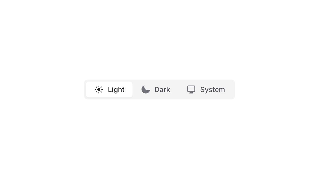
Before we get into the details, just take a look at how simple it is now to create a dark mode switcher like the one shown above. Here is the exact code that was used for that switcher:
Copy to clipboard
<flux:radio.group variant="segmented" x-model="$flux.appearance"> <flux:radio value="light" icon="sun">Light</flux:radio> <flux:radio value="dark" icon="moon">Dark</flux:radio> <flux:radio value="system" icon="computer-desktop">System</flux:radio></flux:radio.group>Here's another code snippet to make an even simpler toggle button:
Copy to clipboard
<flux:button x-on:click="$flux.dark = ! $flux.dark" ... />New JavaScript APIs
As you might have noticed in the code snippets above, Flux now ships with a magic $flux object available to you inside Alpine expressions.
There are two dark-mode related affordances on this magic object: .dark and .appearance.
You can get/set the dark state of an app using the $flux.dark boolean property. You can also get/set the theme preference for an app using the $flux.appearance property (which will be one of three values: light, dark, and system).
Given these two simple properties, you should be able to accomplish any type of dark mode control widget you'd like. For example, a dark mode select, a dropdown menu, a toggle button, a toggle switch, radio groups, cards, or segmented radios. The sky's the limit.
If you need control from outside of Alpine, we've also shipped a global Flux object on the window called window.Flux.
Now, you can do something like this:
Copy to clipboard
let button = document.querySelector('...')button.addEventListener('click', () => { Flux.dark = ! Flux.dark})What's going on under the hood?
Out of the box, Flux will add/remove a .dark class to the <body> element of your page.
This means you can easily configure Tailwind to honor this class instead of the system preference using Tailwind configuration like so:
Copy to clipboard
module.exports = { darkMode: 'selector', ...}Flux takes care of all the tricky bits like storing the user appearance preference in local storage to persist that choice between page loads.
We are also listening for system preference changes at run-time so that we can adapt the site without waiting for a new page load.
Doing these things yourself is not rocket science, but it certainly is more complicated than you want it to be. Enjoy.