The Changelog
What's new around here?
Succinct and informative updates about Flux.
June 16, 2025
Popovers
Version ^2.2.0
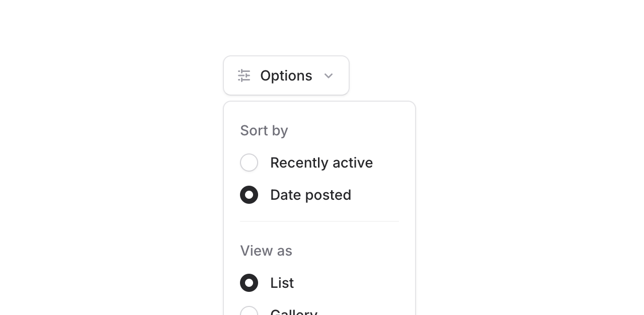
Meet the new Popover component. It's a dropdown, but instead of the "menu" part, it's a generic <div> that you can do whatever you want with.
They're great for things like custom filters and hover cards.
Copy to clipboard
<flux:dropdown> <flux:button>...</flux:button> <flux:popover> <!-- Put whatever you want in here... --> </flux:popover></flux:dropdown>Hover to reveal
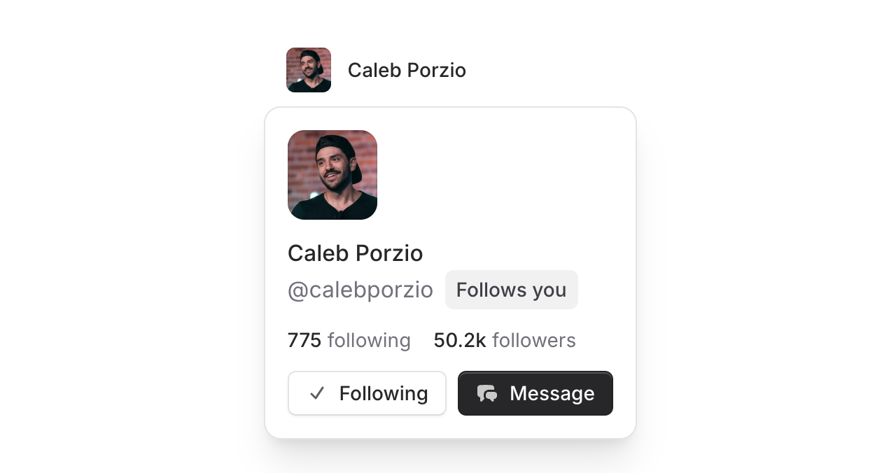
Want to show additional information when users hover over elements? Just add the hover prop and you're set. This is perfect for user profile previews, interactive tooltips, or any contextual information you want to reveal on hover.
All. The. Details.
As with every other component in Flux, we left no stone unturned and sweated every detail for this popver.
Programmatic control: Bind the open/closed state to a Livewire property for complete control over when the popover shows and hides.
Copy to clipboard
<flux:dropdown wire:model="showProfile"> <flux:button>Profile</flux:button> <flux:popover>...</flux:popover></flux:dropdown>Accessibility by default: ARIA attributes like aria-expanded are automatically managed for you. Screen readers get all the context they need about the popover's state and relationship to its trigger.
Native browser behavior: Because we use the native popover attribute under the hood, you get all the goodness that comes with it—Escape to close, Enter to open, proper tab order, and the popover will automatically close when you tab away from it.
Anchor positioning: The popover intelligently positions itself next to the trigger element. You can fine-tune everything with offset, gap, position, and align props.
Smart edge detection: If the popover would open too close to the bottom of the screen, it flips to show above instead; same for left/right edges.
Overflow handling: When there's not enough room to show the full popover content, it becomes scrollable automatically so nothing gets cut off. Your users can always access everything inside.
All of this complexity is completely hidden from you as the developer. Just drop in the component and it works beautifully everywhere.
Check out the Popover documentation for more examples and detailed API reference.
March 25, 2025
Avatars
Version ^2.1.0
We've added a new Avatar component to Flux UI. It's a small, but important, piece of UI that we held off on until we could give it the attention it deserves. Let's take a look.
Adding an avatar to your app is straightforward:
Copy to clipboard
<flux:avatar src="https://unavatar.io/x/calebporzio" />Fallbacks
Not everyone has a profile picture, so we wanted to make sure the alternatives still look good.
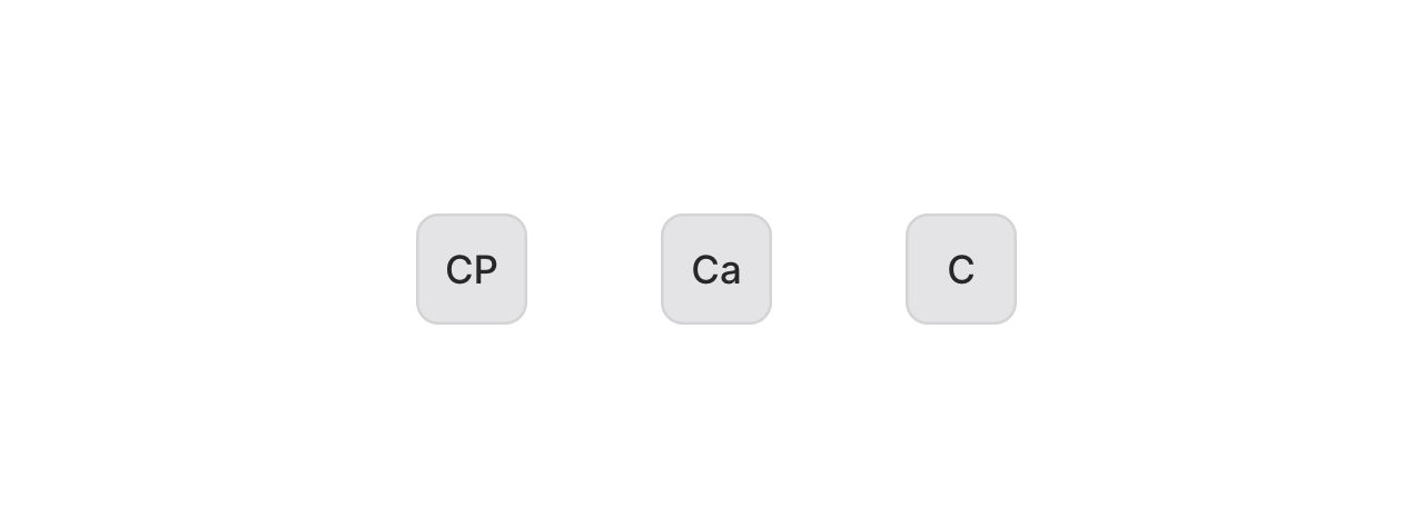
When no image is provided, the avatar component will use the name to generate initials:
Copy to clipboard
<!-- Generates "CP" from the name --><flux:avatar name="Caleb Porzio" /><!-- Or control exactly what shows --><flux:avatar initials="Ca" /><!-- Even show just a single initial --><flux:avatar name="Caleb Porzio" initials:single />Colors
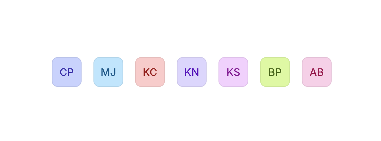
We added some sensible color options, including an auto-color feature that gives users a consistent identity.
Copy to clipboard
<!-- Choose from 17 preset colors --><flux:avatar name="Caleb Porzio" color="indigo" /><!-- Or let Flux deterministically generate a color --><flux:avatar name="Caleb Porzio" color="auto" /><!-- Provide a seed for consistent colors --><flux:avatar name="Caleb Porzio" color="auto" color:seed="{{ $user->id }}" />The color="auto" option creates a color based on the name, so the same user gets the same color consistently. A small detail that helps with visual recognition.
Badges
Add status indicators or notifications:
Copy to clipboard
<!-- Simple notification dot --><flux:avatar badge badge:color="green" src="https://unavatar.io/x/calebporzio" /><!-- Notification count --><flux:avatar badge="25" src="https://unavatar.io/x/calebporzio" /><!-- Custom badge content --><flux:avatar src="https://unavatar.io/x/calebporzio"> <x-slot:badge> <img class="size-3" src="https://unavatar.io/github/hugosaintemarie" /> </x-slot:badge></flux:avatar>Groups

Group avatars together to save on horizontal space when needed:
Copy to clipboard
<flux:avatar.group> <flux:avatar src="https://unavatar.io/x/calebporzio" /> <flux:avatar src="https://unavatar.io/x/taylorotwell" /> <flux:avatar src="https://unavatar.io/x/jeffrey_way" /> <flux:avatar>3+</flux:avatar></flux:avatar.group>Or use them in tables, dropdowns, and other UI elements:
Check out the Avatar documentation for more examples and detailed API reference.
March 10, 2025
Callouts
Version ^2.0.5
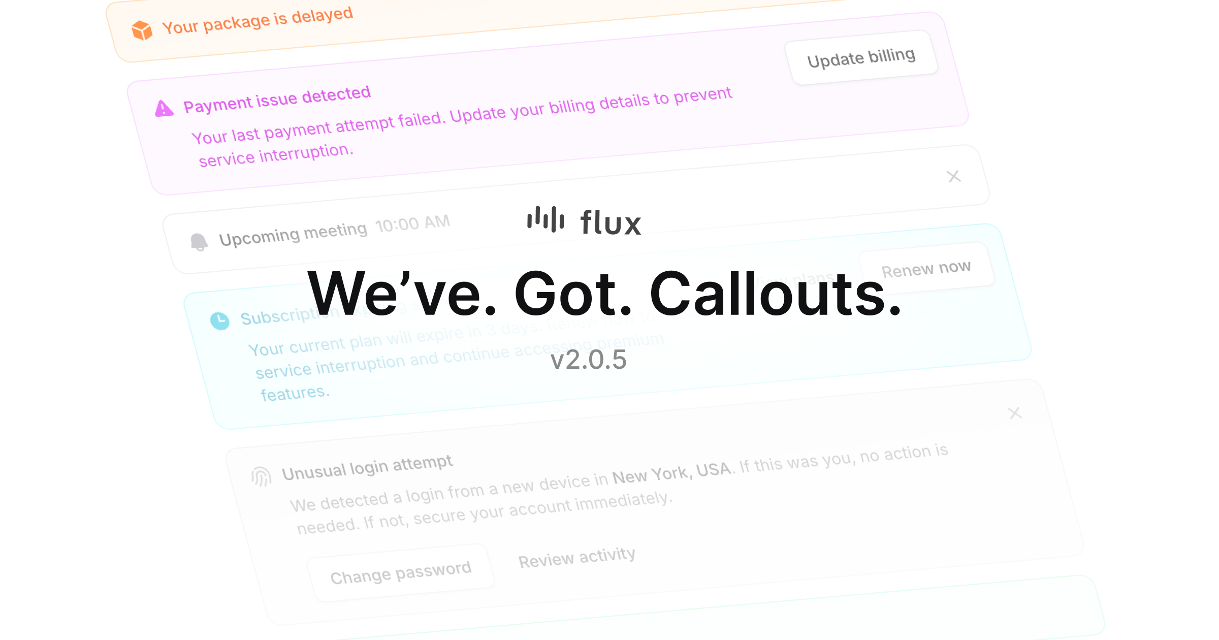
We just added Callouts to Flux! These components help draw attention to important information in your app and guide users on what to do next. Great for announcements, alerts, and feature highlights.
Colors & variants
Callouts ship with common variants for visually signaling different levels of urgency like success, warning, and danger. However, we also support any Tailwind color you'd like to use instead.
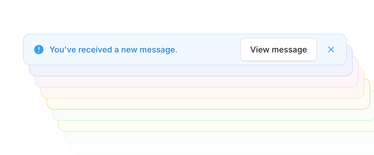
Actions
Callouts support action buttons to make it easy for users to take the next step right away. For tighter spaces, our "inline" mode puts actions right next to your message.
This works really well for things like upgrade prompts, account notifications, or introducing new features.
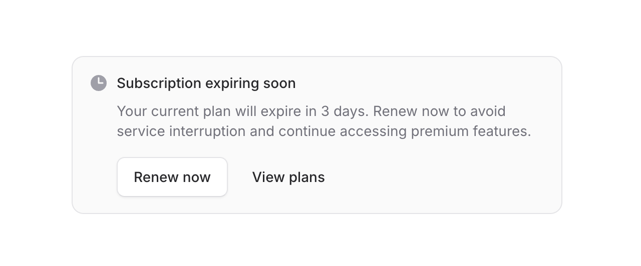
Flexible layout
Sometimes you may want to render your callout icon inside the heading to save space. Controlling this is as simple as adding the icon prop to the heading component instead of the root callout.
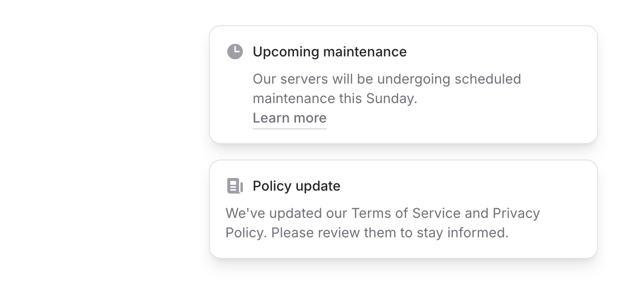
Dismissible

Flux callouts offer a dedicated controls slot for adding compact action buttons. This makes it easy to do things like add dropdown menu shortcuts or dismiss icon buttons and control their behavior however you want.
Callouts are available now as of Flux v2.0.5. Like all Flux components, they're fully responsive and dark mode ready right out of the box. We hope you find them useful—we know we will!